Run QA
Update: 3/11/2008
All of my analysis leading up to the preliminary result uses one runlist which consist of the golden runlist from below plus about a dozen runs from the jet group's list. I added to my list any run that the jet group deemed good as long as the run log browser for that run didn't show any problems. the final runlist can be found here.
--------------------------------------------------------------------------------
Update: 6/19/2007
At the collaboration meeting in Berkeley some of out collaborators pointed out some flaws in my initial QA, most notably that I did not include BBC time bin #6. I have now redone my run QA and asymmetry calculations including this timebin. This results in a new 'golden' runlist which can be found below.
All pages below should be up to date.
--------------------------------------------------------------------------------
My first task is to determine a preliminary runlist over which I will run my analyses. Using Murad's jet QA as a guide (found here), I have looked at a number of different event criteria. At the moment, I am focusing on the second longitudinal period runs only. The data set is comprised of about 390 runs, with about 420,000 triggered events (including production and test L2-G triggers.) Each run number has an index (for easier plotting;) this index can be found here. I am also (for now) restricting myself to one trigger,:
- HTTP-L2Gamma (137611)
- Min Bias (117001, for reference)
Some book keeping stats for this running period
- Run Range: 7131043 - 7156040
- Fill Range: 7847 - 7957
- Days: 131 - 156 (May 11 - June 5, 2006)
My results can be found on the pages below.
Preliminary Run List
As of 2/1/07 I have created a preliminary list of 'good' runs. If a run failed any of my QA tests for either HT trigger, I excluded it from this list. I tried to be as discriminating as possible for this list. I feel it will be easier to go back and add runs if they are later determined to be good. The preliminary list includes 302 runs, and can be seen by clicking below.
Furthermore, using the run log browser I have checked all of my excluded runs to see if there is an obvious reason why it shouldn't be included. Many of the runs did indeed have glaring reasons, but not all of the runs. A summary of this check can be found here.
Eta v. Phi
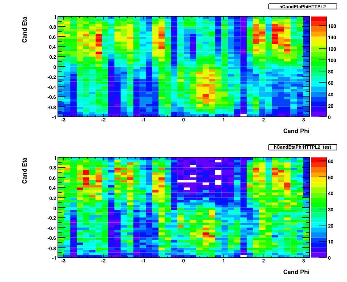
The above plots show 2-d histograms of eta and phi for pion candidates. The plot on the top shows the candidates from the production L2-G trigger. The plot on the bottom shows the eta and phi distribution for candidates from the L2-G 'test' trigger. As of May 2007, I am not using these to exclude any runs. I used Frank's pion trees to make these plots, imposing the following cuts on any pion candidate:
- Energy > 0.1 GeV
- PT > 5.0 GeV
- Asymmetry < .8
- Mass between .08 and .25 GeV
- No charged track association.
- BBC Timebin = 7,8 or 9.
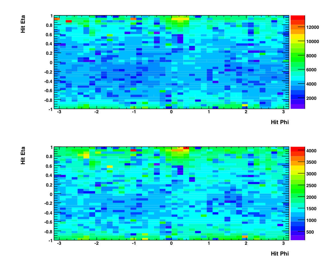
The above plot shows histograms of the eta and phi positions of individual photons (hits). Again the top plot shows photons from events from the production L2-G trigger while the bottom shows photons from the 'test' L2-G trigger. Note the lack of structure in these plots compared to the candidate plots. This is due to the SMD, which is used in making the top plots (i.e. a candidate needs to have good SMD information) and unused in the bottom plots (a hit does not reference the SMD.) The status tables for different fill periods can be found at the bottom of this page. You can see that there are some gaps in the smd which could be responsible for the structure in the Candidate plot.
Event Ratios

This plot shows, as a function of run number, the number of L2-G triggered events divided by the number of minbias triggers (w/ prescale.) This shows all the runs, before any outliers are removed.

This plot above shows a the histograms of the top plots. There is some subtlety here (as you have probably noticed) in that the data needs to be analyzed in four sets. The largest set (corresponding to the top left histogram) is all of the L2-G triggers from the 'production' level data, which consists of all the runs after ~100. The other three sets are all subsets of the 'test' status (i.e. the first ~100 runs) and reflect changes in the prescale and threshold levels. The characteristics from each subset are noted below.
Runs 3 -14 (top right):
Initial test thresholds
Prescale = 1
Runs 23 - 44 (lower left):
Higher thresholds (?)
Prescale = 2
Runs 45 - 93 (lower right):
Lower thresholds
Prescale = 1
Runs 93+ (top left):
Final thresholds (5.2 GeV)
Prescale = 1

The above plot shows the event ratio after outliers have been removed. To identify these outliers I took a four-sigma cut around the mean for each of the four histograms shown above, and removed any runs that fell outside this cut. The list of outlying runs and thier characteristics can be found here.
Pion Number


On the left are two plots showing the number of pions per triggered event (L2-G trigger) as a function of run index. The top plot is for all of the runs when the L2-G trigger had production status, while the bottom plot exhibits the runs for which the L2-G trigger had 'test' status (about the first 100 runs or so.) On the right are histograms of these two plots. To remove outliers from the runlist, I made a two-sigma cut around the mean of these histograms and removed any run that fell outside this range. Below are plots showing pion number per triggered event after the outlying runs have been removed. Note the change in scale from the original. A list of excluded runs and thier properties can be found here.

As you can see, there is some funny structre in the above plot. It's almost bi(or tri)-modal, with the mean number of pions per trigger jumping between .06 and .08 (or even .1). I think this is a consequence of the SMD. See below.

The above is a plot of the number of triggered photons that have GOOD SMD status normalized by the total number of triggered photons, as a function of run number. While this is crude, it gives an approximate measure of the percent of active SMD strips in the barell for each run. As you can see, the peaks and vallys in this plot mirror the peaks and vallys in pion yield above. Since the SMD is not required to satisfy the trigger but IS required to reconstruct a pion, we would expect that the pion reconstruction efficiency would decrease as the number of active SMD strips decreases. Indeed this is what appears to be happening.
I used Frank's pion trees to make these plots, imposing the following cuts on any pion candidate:
- Photon Et > 0.1 GeV
- PT > 5.2 GeV
- Asymmetry < .8
- Mass between .08 and .25 GeV
- No charged track association.
- BBC Timebin = 6, 7, 8, or 9.
- 'Good' SMD status.
Pion Yields
currently not in useSingle Spin Asymmetries
Run By Run
Runs are indexed from the beginning of the long-2 period. For reference, take a look at this file.

By Transverse Momentum


Tower and SMD info
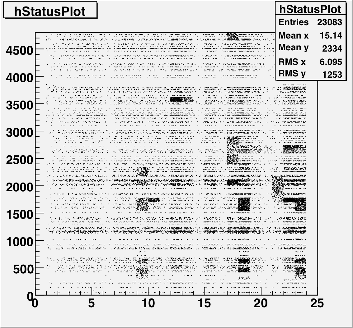
This is a plot of the tower status as a function of relative day (since the start of the second longitudinal period.) The 4800 towers are on the Y-Axis and Days are on the X axis. A dot means that that tower had a status other than good during that time period.
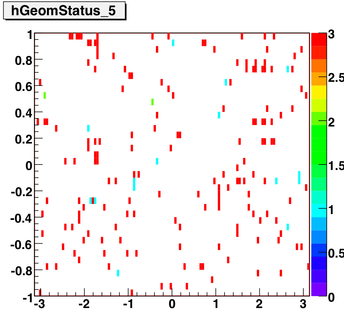
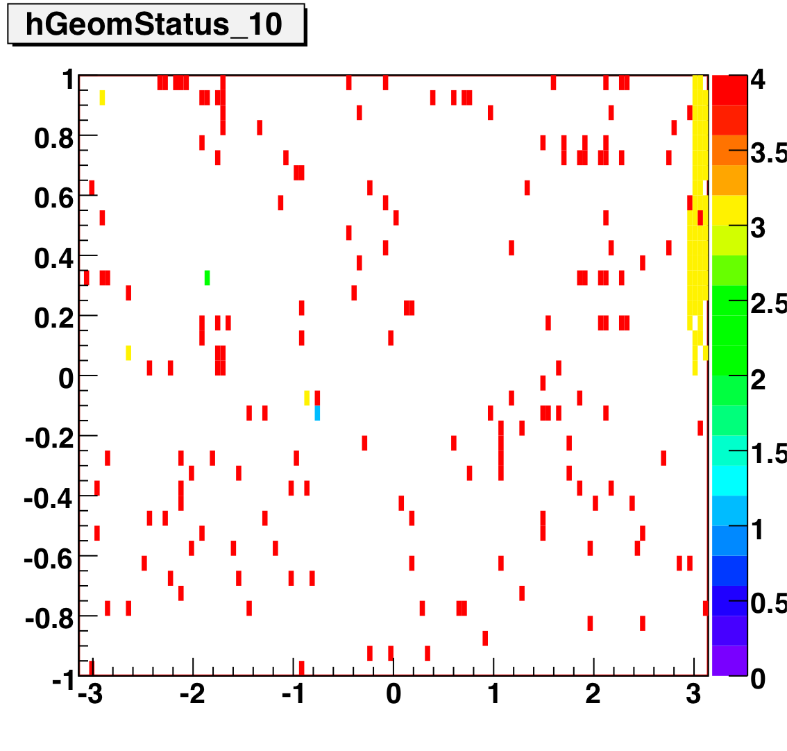
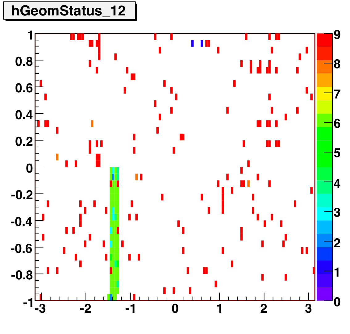
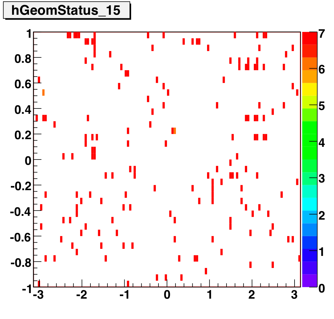
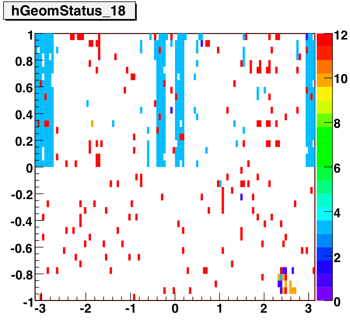
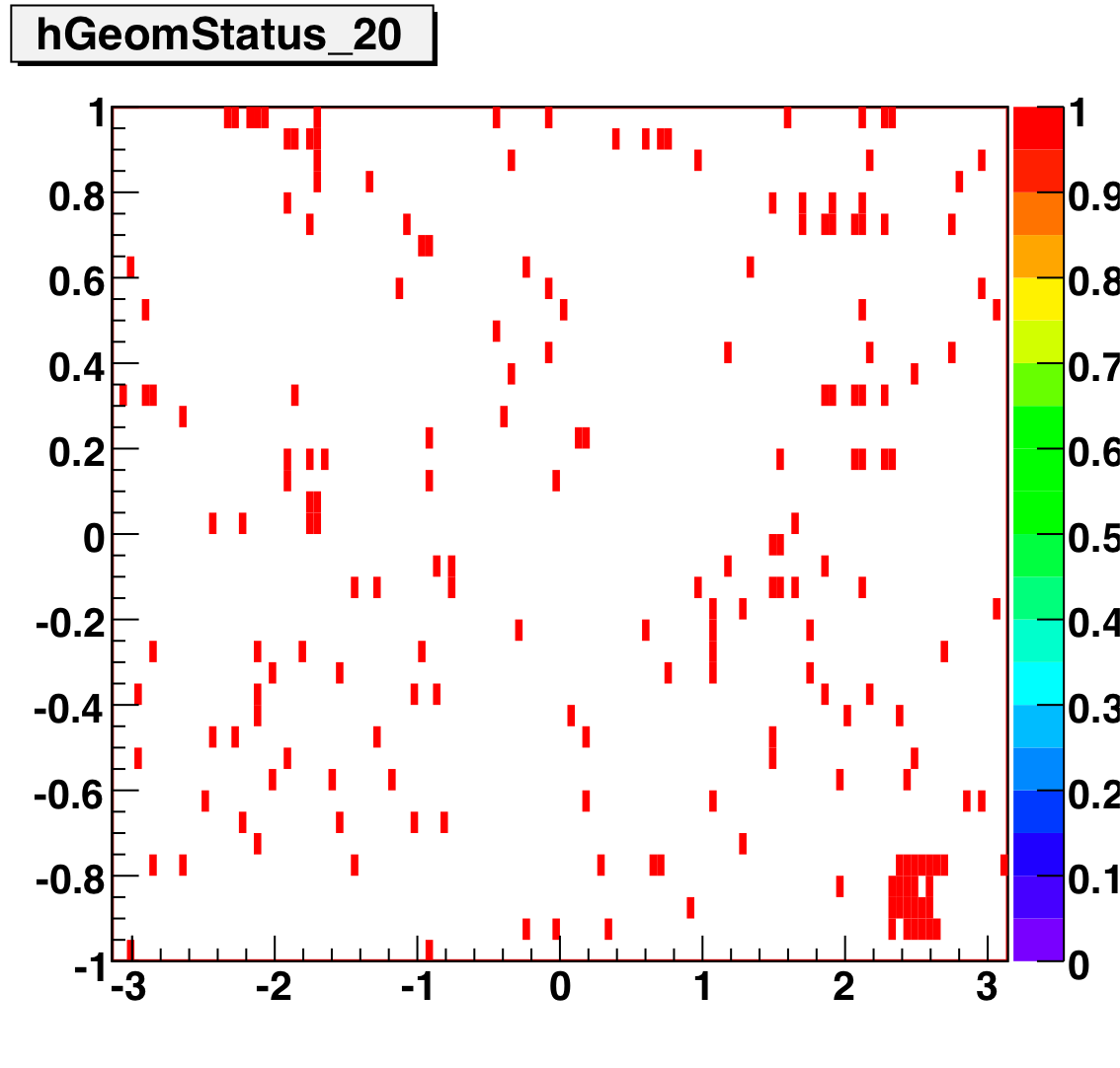
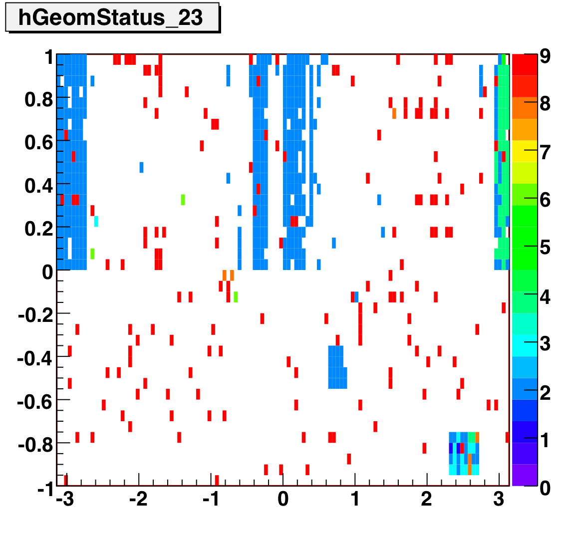
Tower Status Geometry
The below plots show the status as a function of phi and eta for different days representing different status periods. The title of the histogram refers to the relative day in the second longitudinal period (e.g. hGeomStatus_5 is for the fifth day of long-2.) The x and y axes correspond to detector phi and eta, and any space that is not white is considered a 'bad' tower. As you can see, for most of the barell for most of the time, most of the towers are good. Only for specific day ranges are there chunks of the barrel missing.
SMD Status
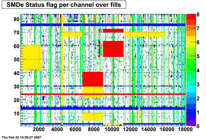
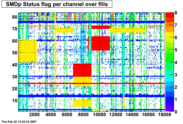
These two plots were made by Priscilla and they show the SMD status flags for SMD strips vs. Fill number. In these plots the strip number is plotted along the X-axis and the fill index number is plotted along the Y-Axis. Priscilla's fill index list can be found here. The important range for my particular analysis (i.e. the second longitudinal range) runs between fill indices 41 - 74. For my analysis I ignore any SMD strip that has a status other than good (== 0).
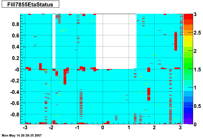
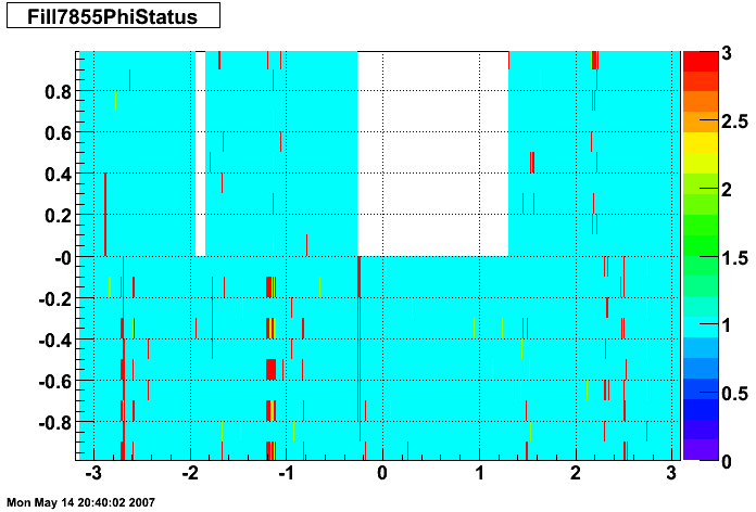
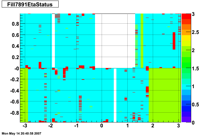
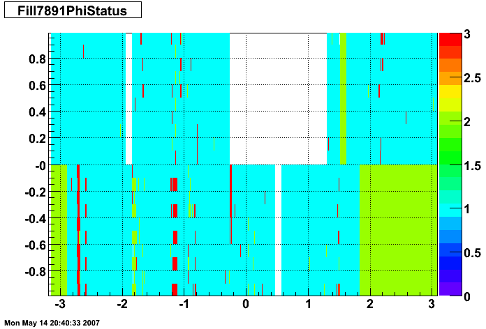
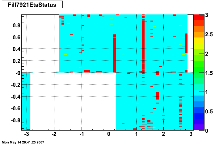
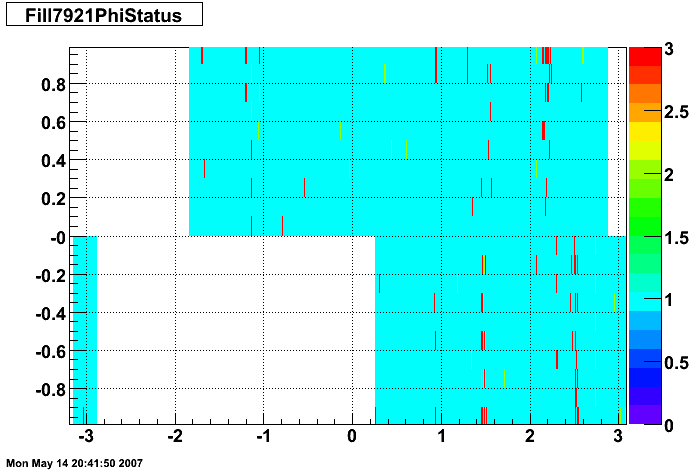
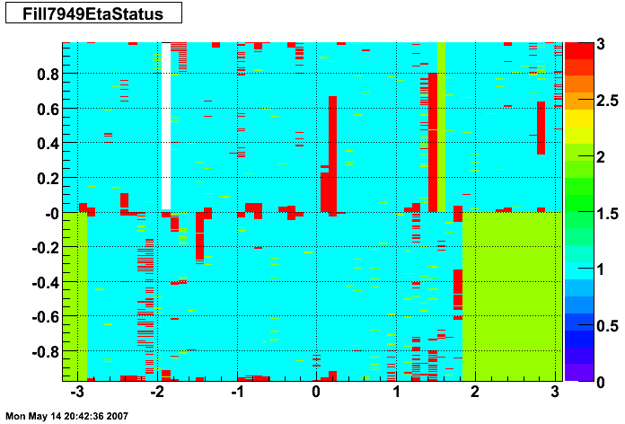
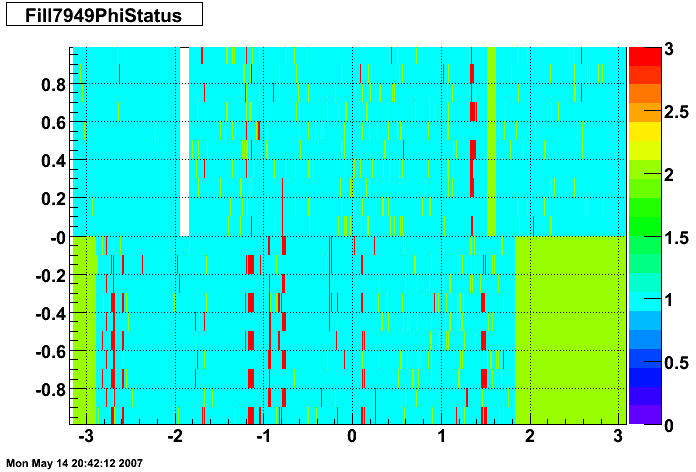
SMD Status Geometry
The plots below show the smd status as a function of geometry. The location of the strip in eta-phi space (w/ phi on the x axis and eta on the y axis.) You can see the eta and phi strip planes for four different fills (representative of different configurations) 7855, 7891, 7921, and 7949. Using Priscilla's iindexing these fills correspond to fills 46, 57, 68, and 72 in the above plots. We can see that these runs mark the beginning of major changes in the status tables, and each plot below represents a relativley stable running period. For my analysis I consider any area that is not light blue (i.e. any area with status other than 1) to be bad. Please note the difference between the SMD geometry plots and the BTOW geometry plots, namely, in the SMD plots whitespace represents 'bad' strips, whereas in the BTOW plots whitespace represents 'good' towers. All plots below were made by Priscilla.
Z Vertex


The above left plot shows average z vertex as a function of run index for the L2-G trigger. The upper plot shows all runs for which the L2-G trigger had production status, while the lower plot shows the first ~100 runs, for which the L2-G trigger had test status. The above right plot shows a histogram of the points on the above left plot. These plots show the average z vertex for all the events in a run, that is, they are not limited to pion candidates (as in some of the other QA measures.)

this plot above shows the average z vertex of L2-G events as a function of run index, with outlying runs removed. To identify outying runs, I took a four-sigma cut around the mean of each histogram (showed top right) and excluded any run for which the average z vertex fell outside this cut. Currently, I separate the 'test' from 'production' runs for analysis of outlyers. It would not be hard to combine them if this is deemed preferable. A list of the excluded runs, with thier average z verex can be found here.