- jwebb's home page
- Posts
- 2019
- 2018
- 2017
- 2016
- 2015
- 2014
- 2013
- November (1)
- October (1)
- September (1)
- July (1)
- June (1)
- April (1)
- March (3)
- February (1)
- January (1)
- 2012
- 2011
- December (2)
- September (3)
- August (5)
- July (6)
- June (6)
- May (1)
- April (5)
- March (5)
- February (2)
- January (2)
- 2010
- December (3)
- October (3)
- September (2)
- August (2)
- June (2)
- May (4)
- April (4)
- March (2)
- February (4)
- January (10)
- 2009
- 2008
- 2007
- 2006
- July (1)
- My blog
- Post new blog entry
- All blogs
Isolation cut, data vs. MC, take 1
Abstract: We compare data to Monte Carlo for the ratio of single-tower (corrected) ET to the ET summed over R<0.3.
1.0 Data set and cuts
- electrum run
- select trigger id 137641
- standard definition of gamma candidate (3x3 cluster)
- full EEMC acceptance
2.0 MC event sample
- pibero's directories
- No trigger simulation
- full EEMC acceptance
3.0 Data vs MC comparison
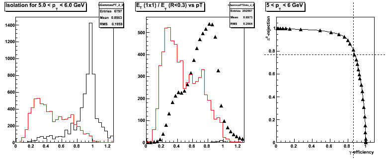
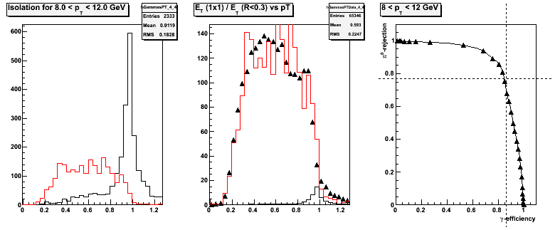
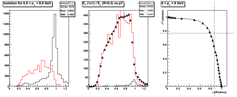
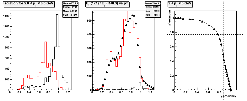
The following plots show the distribution of events vs the isolation ratio, defined as the 1-tower ET, corrected for shower leakage, divided by the ET of tracks+tower summed over R<0.3. Each plot has 3 panels:
- Left panel: MC gamma sample in black, MC jet sample in red w/ common normalization.
- Center panel: data sample as black triangles, summed MC gamma and jet sample in red, MC gamma alone in black.
- Right panel: efficiency vs rejection power.
Figure 1 -- Comparison of the isolation ratio bettween data and Monte Carlo for 12 < pT < 20 GeV.
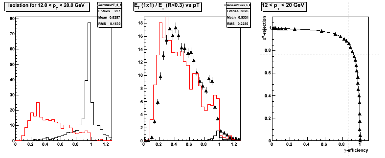
I went with this plot first because the data and MC agree the best here. As we go to lower pT we start to see differences in the isolation ratio, almost certainly due to the trigger sculpting the dadistribution.
Figure 2 -- Comparison of the isolation ratio bettween data and Monte Carlo for 8 < pT < 12 GeV.
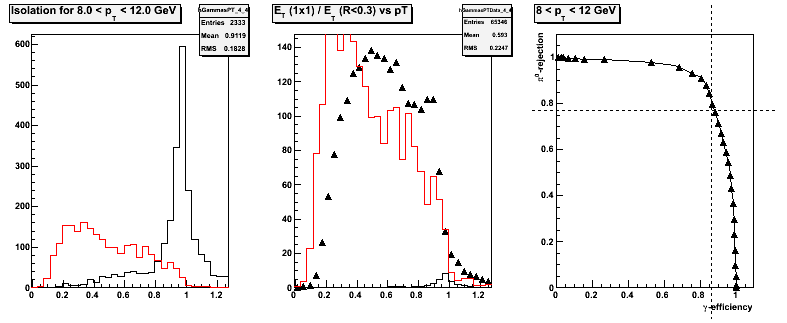
Figure 3 -- Comparison of the isolation ratio bettween data and Monte Carlo for 6 < pT < 8 GeV.
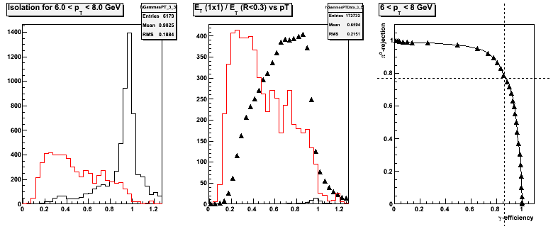
Figure 4 -- Comparison of the isolation ratio bettween data and Monte Carlo for 5 < pT < 6 GeV.
4.0 Discussion
There are significant differences between data and MC at low pT, but this is to be expected since I have not simulated the trigger. I'm looking at a quick and dirty hack of the L0 and L2 triggers in simulation, and seeing the same qualitative behavior as in the data -- the yield at lower ratios becomes less pronounced.
5.0 Take 2 -- Data vs MC with a quick 'n' dirty trigger simulator
Figure 5.1 -- Comparison of data to Monte Carlo, plotted vs the isolation ratio, for 12 < pT < 20 GeV.
.png)
Groups:
- jwebb's blog
- Login or register to post comments
