- dilks's home page
- Posts
- 2019
- 2018
- December (1)
- November (1)
- October (1)
- August (2)
- July (4)
- June (3)
- May (1)
- April (2)
- March (2)
- February (1)
- January (5)
- 2017
- December (3)
- November (1)
- October (2)
- September (3)
- August (2)
- July (2)
- June (1)
- May (2)
- March (3)
- February (3)
- January (3)
- 2016
- November (2)
- September (4)
- August (2)
- July (6)
- June (2)
- May (3)
- April (1)
- March (2)
- February (3)
- January (2)
- 2015
- December (3)
- October (3)
- September (2)
- August (6)
- June (3)
- May (3)
- April (4)
- March (3)
- February (5)
- January (3)
- 2014
- December (1)
- November (1)
- October (3)
- September (4)
- August (3)
- July (3)
- June (2)
- May (2)
- April (2)
- March (1)
- 2013
- 2012
- 2011
- My blog
- Post new blog entry
- All blogs
PMT ADC rates
The following link is a directory of images showing the ADC counts plotted for 10,000 events in each cell (left image) along with a histogram of total ADC counts (right image).
http://www.star.bnl.gov/protected/spin/dilks/pmt_adc/png/
Some of the cells have slowly varying ADC rates, others have rates that jump from one value to another, and others have ADC counts that vary over all possible ADC values. I have attempted to classify some of these, but I have come to the conclusion that it's better to look at each ADC rate individually.
Figure 1: Here's an example constant ADC rate:
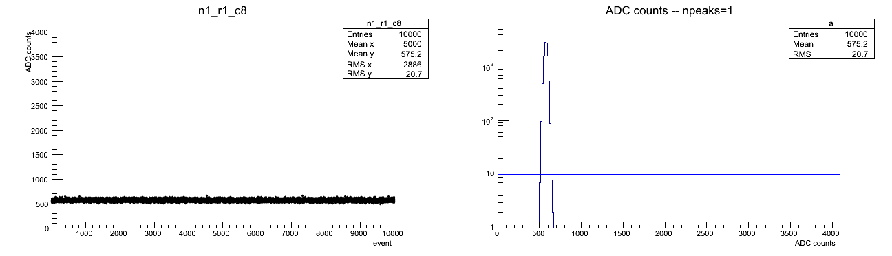
Figure 2: Here is one that varies:
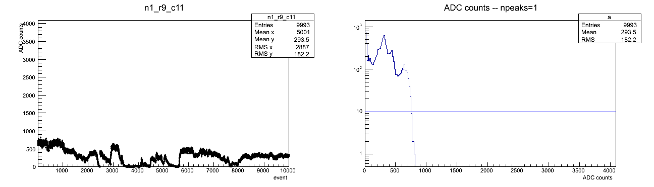
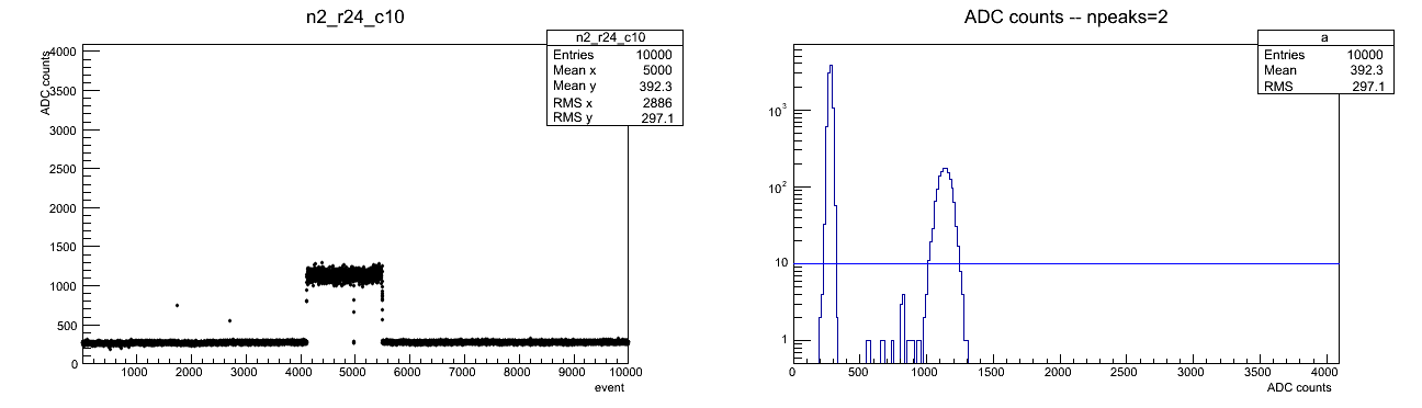
Figure 3: Here is one that jumps between two mean ADC counts:
.
.
.
I looked at two measurements on the distribution of ADC counts:
1. Standard deviation of ADC counts
2. Number of peaks in ADC counts histogram (e.g. 2 peaks corresponds to fluctuation of ADC rate between two values)
The peaks are counted by binning the ADC counts in wider bins (256 bins rather than 4096) and defining a cutoff (10 counts) above which a peak is counted (the cutoff is an attempt to filter out outliers which can cause additional peaks). This method is of course not completely accurate and could definitely be improved, but it should give a sense of which cells have varying ADC rates.
The peak counting does not identify jumping variations when the jumping is not that significant; this can be solved by increasing the number of bins in the ADC counts histogram, but creates more outliers or more rapid variations in the distribution which will be counted as extra peaks.
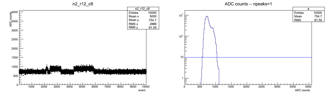
Figure 4: An example of a cell with small variation is n2 r12 c8
.
.
.
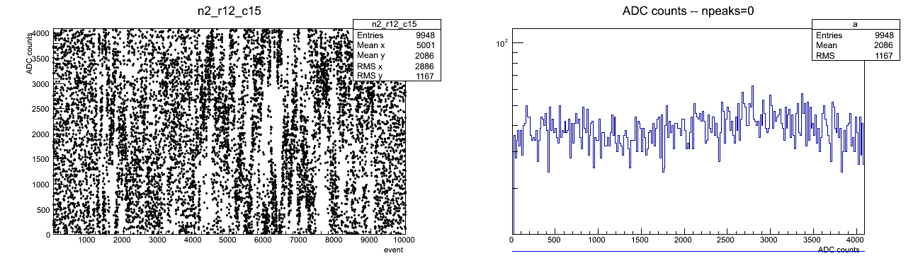
Figure 5: Sometimes, variation spans all possible ADC counts, e.g. n2 r12 c15
.
.
.
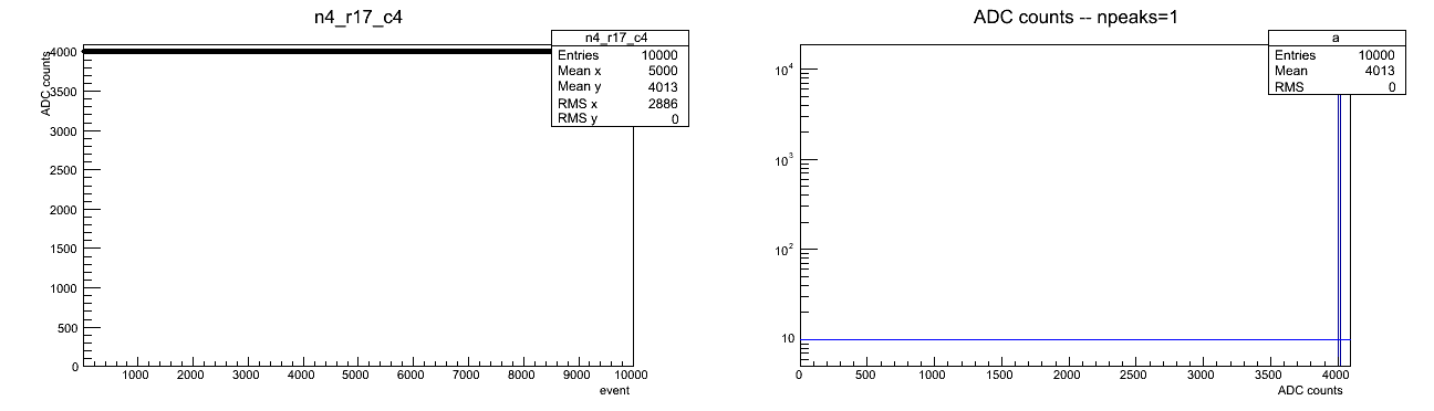
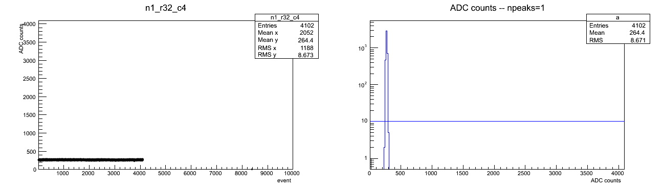
Figure 6: ADC rate can be strictly constant (rms=0), e.g. n4 r17 c4
.
.
.
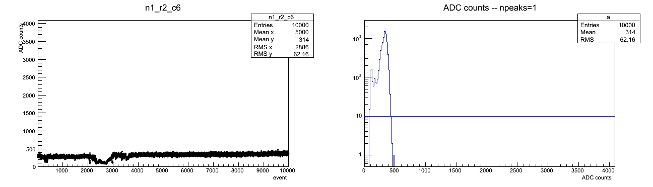
Figure 7: Sometimes, we have some variation, but low standard deviation and one peak is counted, e.g., n2 r9 c13
.
.
.
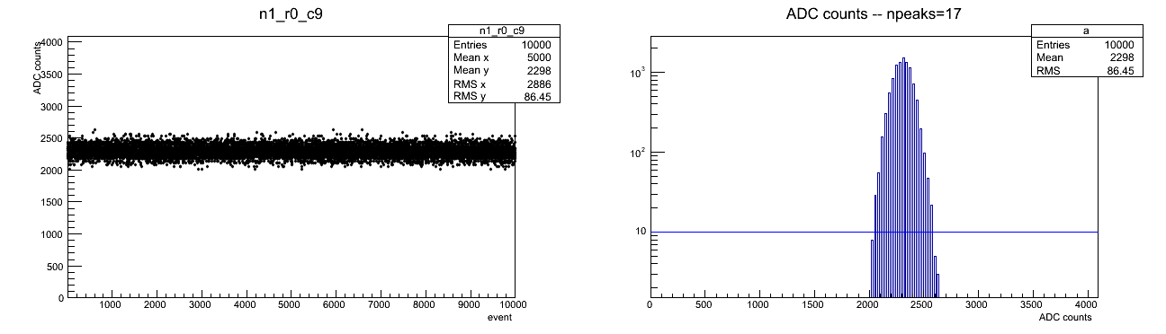
Figure 8: Cases with only every 32nd bin filled (bitshift), e.g. n1 r0 c9
.
.
.
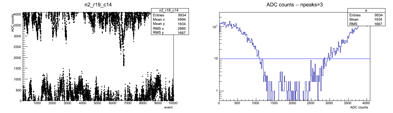
Figure 9: Only small and large values filled (overflow?), e.g. n2 r19 c14
.
.
.
Figure 10: Some cells have less than 10,000 events recorded
.
.
.
.
Figure 11: PMT "health"
- 0 (white) - ok
- 1 (light blue) - jumping
- 2 (green) - varying
- 3 (yellow) - jumping and varying
- 4 (red) - no or low signal
.png)
The following plots attempt to show how frequently and where some of these cases occur, but it is best to go through each cell, one-by-one (as above)
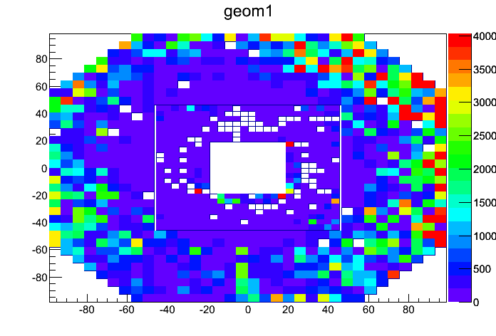
Figure 12: Average number of ADC counts
.
.
.
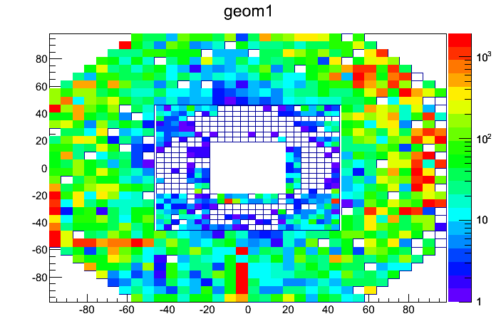
Figure 13: Standard deviation of ADC counts (>100 is likely to have variation)
.
.
.
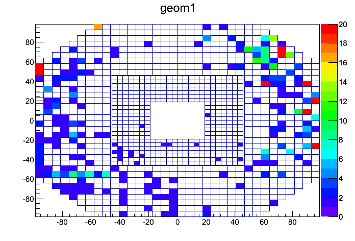
Figure 14: Number of peaks in ADC histogram, minus 1 (i.e. if a cell has nonzero value, there is likely jumping ADC rate)
Groups:
- dilks's blog
- Login or register to post comments