Run 9 Dijet 5pt data vs simu - jet pt histograms in slices of eta
The following plots take a look at jet pt for different slices of eta. For now, they've been broken into high jets and low jets, but this is a somewhat arbitrary distinction. Ideally we would look at maybe triggered jet, but for now this is it.
The jet pt histograms are broken into
-1<=eta<0
0<=eta<0.4
0.4<=eta<0.7
0.7<=eta<1
1<=eta<1.2
1.2<=eta<1.4
1.4<=eta<2
If you look at the overlayed ratio plots (data/simu) they appear to have very similar slope except for the low jets in the endcap.
Figure 1. High jet pt in the barrel for different slices of eta.
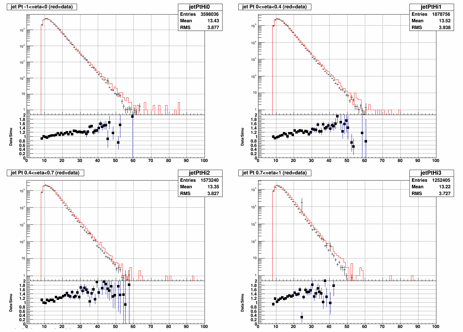
Figure 2. High jet pt in the endcap for different slices of eta.
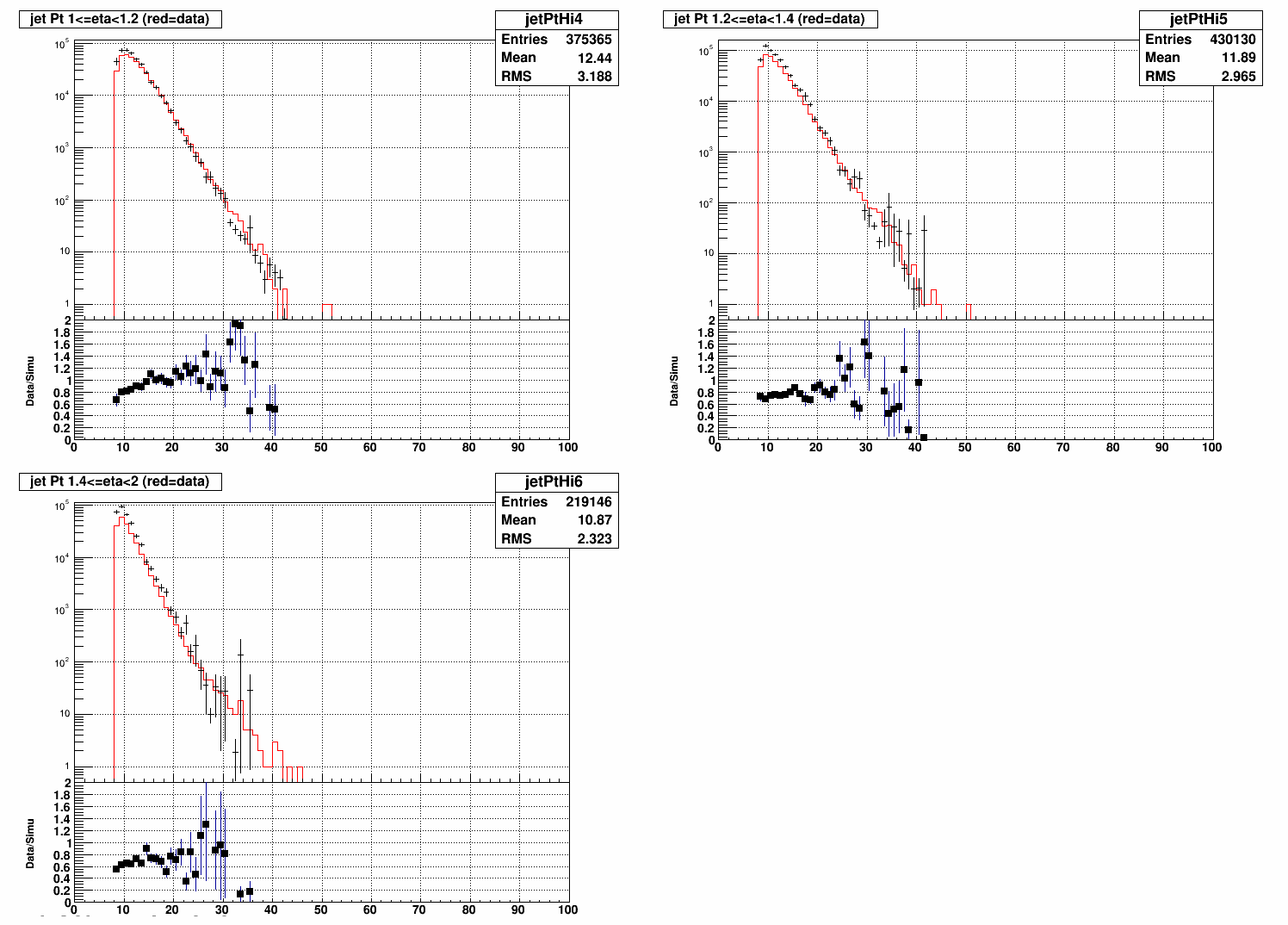
Figure 3. Overlaying all of the ratio plots for high jets from the above comparisons. The barrel consists of the red, orange, yellow, and green sets. The endcap is blue, purple, and black. The data/simu ratio appears to increase simularly for higher pt.
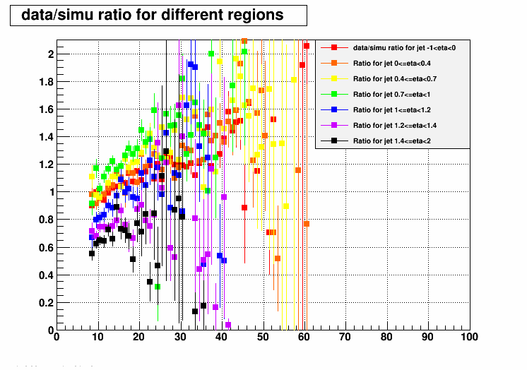
Figure 4. Low jet pt in the barrel for different slices of eta.
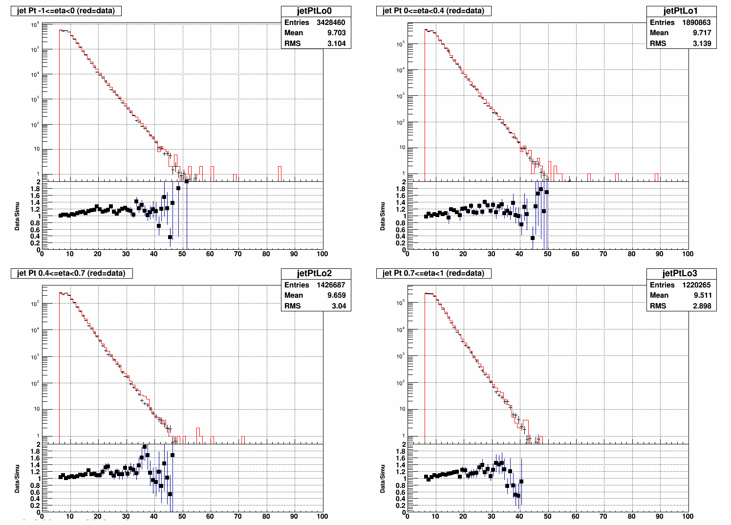
Figure 5. Low jet pt in the endcap for different slices of eta.
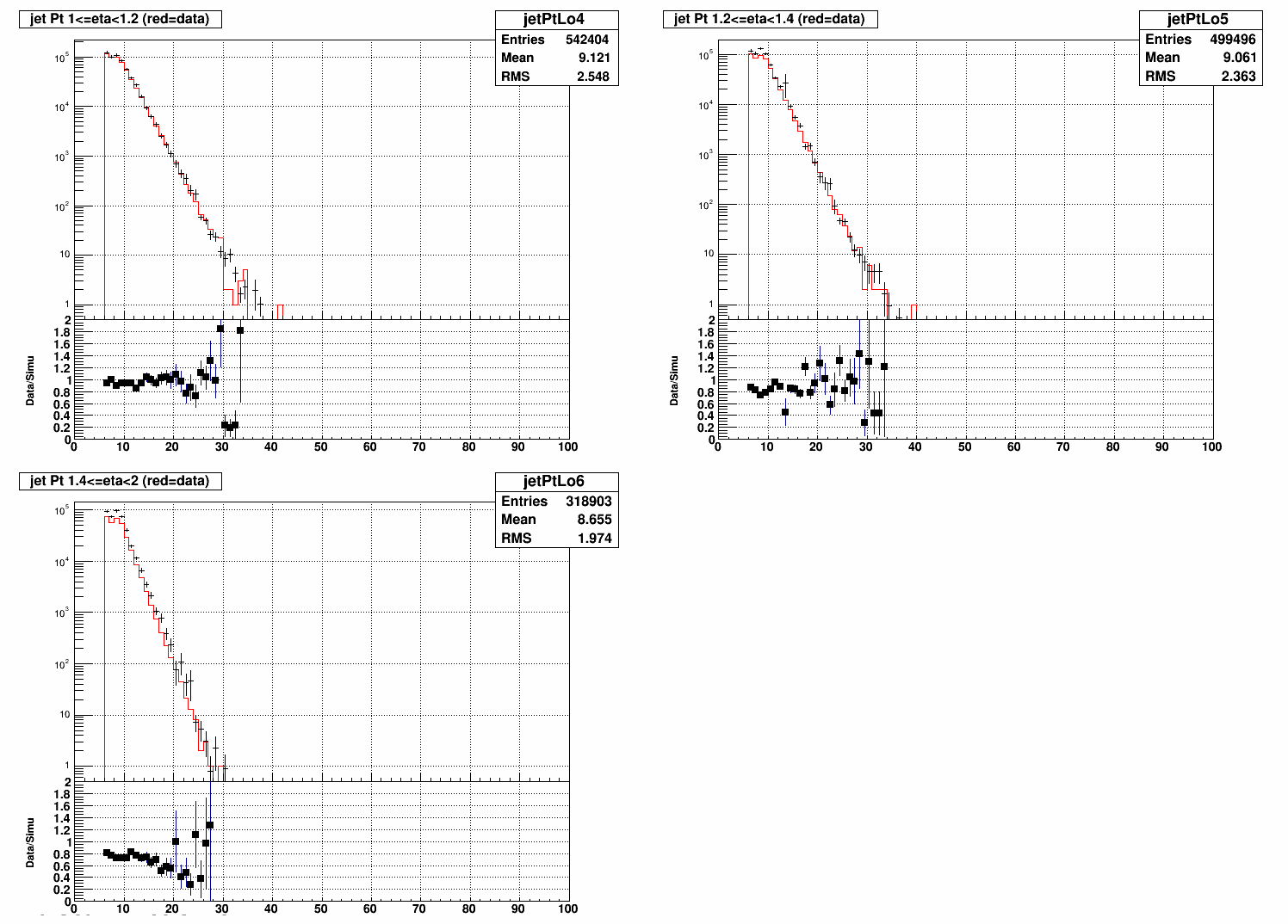
Figure 6. Overlaying all the ratio plots from the low jet pt plots above. Again, we've got red, orange, yellow, and green representing eta slices within the barrel, and then blue, purple, and black for eta slices within the endcap.
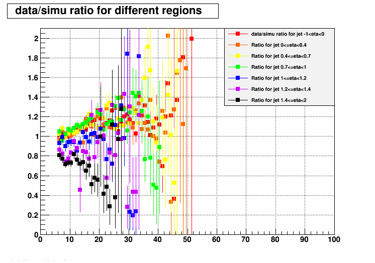
The data/simu ratio for the low jet pt has similar slope for all the eta slices except for the very forward slices.
If you'd like to compare the two sets of profile plots, it might help to open them up into tabs here and here.
- ezarndt's blog
- Login or register to post comments