Simulation request visual accounting
Introduction
The simulation request interface has been into operation for three months now and it is time to think of developing accounting and monitoring interfaces, with goal to detect the hot spots in the workflow and process (embedding / simulation) and be able to see if progress is made in delivering production datasets.
The current interface is based on multiple state progress starting from an "Opened" state up to a "Closed" state. Whenever a request is closed, the timeline ends. Whenever a request is "killed", the request should not be considered to first order (see below for advanced selectors). The list of status follows:
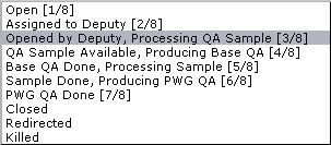
Concept&Idea
A first level of accounting would be to identify how much time is spent in each "state", considering that
- A particular state may appear multiple times (for example, progress moves to stage 6 but the QA fails and the request need to go back to stage 4)
- A particular state may not even appear (perhaps stage 2 is skipped going straight to state 4)
This would mean that the sum of times spent in a particular stage needs to be done and each stage represented only once.
Note that for this to be functional, the deputies and helpers need to be mindful in changing the request states accordingly (the interface may actually help that).
Proposed design
A visual helper would be to then show %tage of times each stage has taken from the full request time. A possible UI and interface would look like
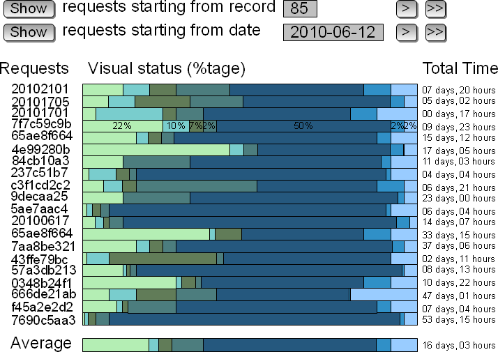
Described:
- Each row represents one request - only ~ 20 requests would be represented (otherwise the color display would be a mess and a compact representation of rows would not be possible as a convenient HTML display but we can revisit this later)
- Each row would show %tages as the row for ID 7f7c59c9b - variant: if the %tage are too small to be displayed, then a on-mouseover display should be considered
- Left hand-side would show the request ID - the ID would be click-able and if clicked, the user would be re-directed to the request history for analysis
- Right hand-side would show the total time (while the bar chart is a relative %tage)
- Two selectors would allow to display records from a record number (this may vary / the above is only a suggestion) or starting from a given date. This would allow comparing past performance and current performances
- Selectors would have forward and fast forward button (likely backward, fast backward buttons not represented)
- The last line would represent an average over the requests selected so the visual effect would allow detecting and analyzing what went well and what went wrong in the individual requests largely deviating from average
Advanced selectors
Likely, this graphical interface would need to be equipped of selectors such as
- Selecting by request type
- Selecting by PWG (so homogeneity within and outside PWG could be analyzed)
- Have the possibility to include (default excluded) the requests ending into a Kill state
- Probably not popular: selector by deputy ...
Example here.
- jeromel's blog
- Login or register to post comments