More Pion mass vs energy
After looking at the energy(E12) effect on the location of the pion mass and correcting for that, I am now studying how my correction to the pion mass affects the shape of the mass peak. I used the linear fit from my analysis of the data from day 86a (shown in figure 1) to calculate a "corrected" pion mass also using the day 86a data. I then made a histogram of the corrected pion mass (figure 2) for the whole energy range (20 to 70 GeV) I used in my origional analysis. I compared this to a histogram of uncorrected pion mass from the same data (figure 3).
Figure 1:
.gif)
Figure 2:
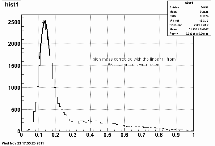
Figure 3:

Figure 4: Showing both corrected (black) and uncorrected(red) on the same plot.

As you can see by looking at the value of sigma for each fit, the pion mass peak in the corrected histogram is sharper than the uncorrected. The same cuts that were used in the pion mass vs energy 86a plot were also used when creating both of these histograms.
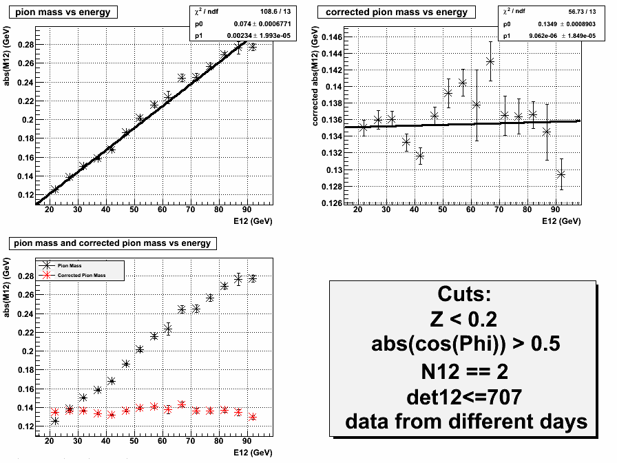
In my previous entry, I only looked at the pion mass vs energy up to 70 GeV due to low number of events at large energy. Since then, I have used data from many different days together to allow for more statistics at higher energies (Figure 5). I was able to get up to about 95 GeV. The plot of pion mass vs energy maintains its linearity at higher energy.
Figure 5:
- klandry's blog
- Login or register to post comments