x1 vs pt in simulation continued
Previously I made a blog entry about x1 vs Pt in simulation data, with and without requiring a trigger fired. You can find that here:
http://drupal.star.bnl.gov/STAR/blog/klandry/2013/feb/12/x1-vs-pt
Continuing from that, I am now looking at the difference of x1 distributions between individual triggers. The triggers I will look closely at are Bemc_JP1_mb, Bemc_HT2_mb_emul, Bemc_HTTP_mb_fast, Bemc_JP0_mb, and Bemc_JP0_etot_mb_L2Jet. The same procedure, set up, and cuts apply as in the previous blog post. As in my other blog post, the x1 distributions were fit with a landau function to determine the location of the x1 peak.
Eventually, the goal of this is to have an understanding of the x1 dependence of pt for Anselms IFF analysis. In his analysis, he uses triggers with ID's:
127221: BemcJP1_mb
127262: EemcHT2_mb_emul
127271: EemcJP1_mb
127501: BemcJP0_mb
127551: EemcJP0_mb
127571: BemcJP1
127575: BemcJP0_etot
127585: BemcJP2
127611: BemcHTTP_mb_L2gamma
127622: BemcJP0_etot_mb_L2Jet
In the previous post, I showed results for both Pt>0.5 GeV and Pt>1.5 for track selection. Since this didn't seem to make a difference, I will only use Pt>0.5 GeV for track selection here.
Let me also point out that in my previous post, I specifically separated events which fired one or more of the triggers on my list and those which didn't. This means that what I called "no trigger" or "trigger condition not met" in that post did not have any events which fired a trigger on the list. This is different than in this post. Here, what I am calling "no trigger" is min bias containing all events. It includes events that did not fire the individual trigger as well as the events that did. This is why the x1 of the red points in my previous blog corresponding to the trigger condition not being met are at a lower x1 than the points corresponding to no trigger in this blog.
First, I looked at the trigger Bemc_JP1_mb and compared it to all the data with no trigger selection. In the top plot, I have plotted the x1 distribution of the JP1_mb trigger (in blue) as well as the no trigger selection for Pt bin 4-6 GeV.
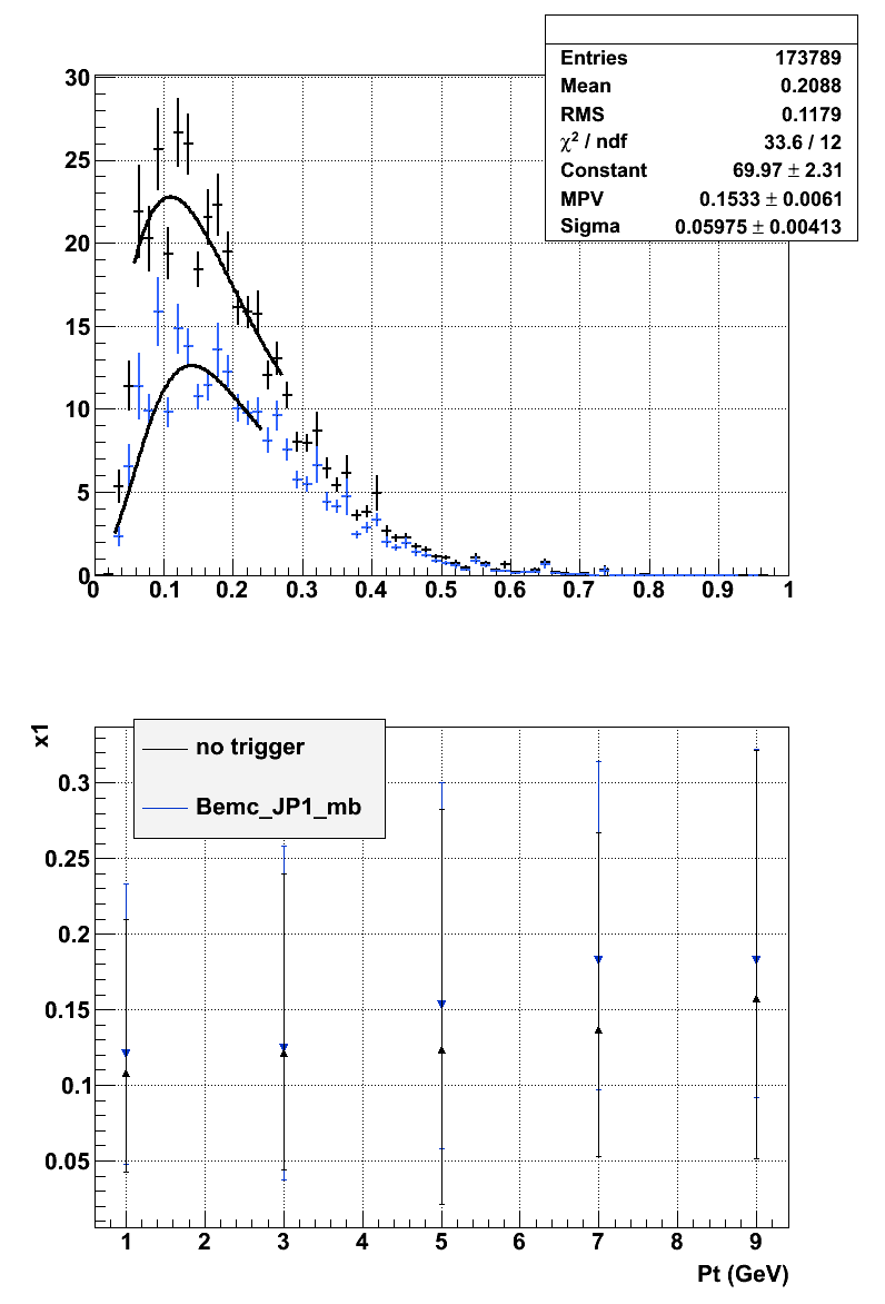
In the lower plot, you can see the Pt dependence of x1. As you can see, the blue points corresponding to the Bemc_JP1_mb trigger have a larger x1 value than the no trigger.
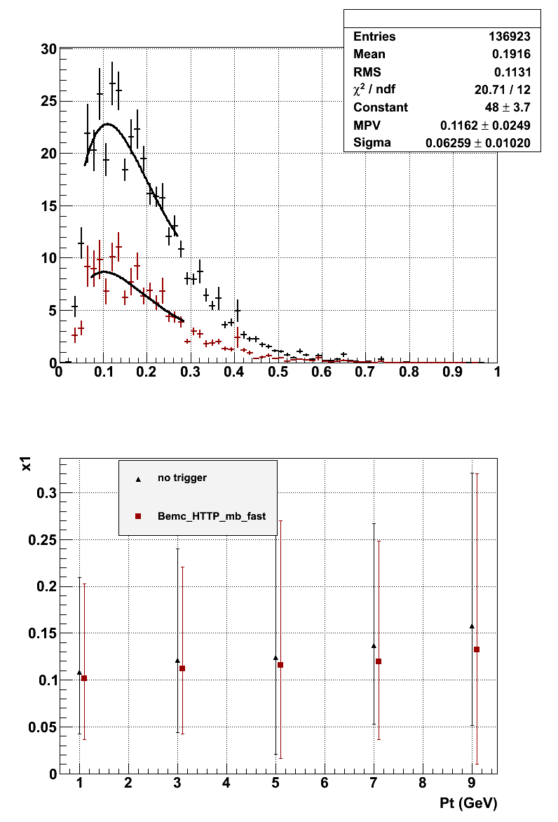
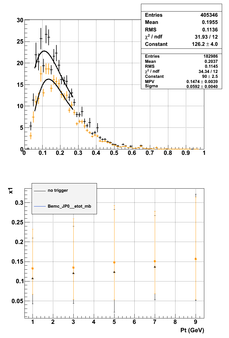
I then did the exact same thing for the Bemc_HTTP_mb_fast trigger. From the top figure, you can see that there are less pion pairs that fired the Bemc_HTTP_mb_fast trigger than the Bem_JP1_mb trigger. Surprisingly the bottom figure shows the x1 values for Bemc_HTTP_mb_fast and no trigger are almost identical. Although the error bars for the no trigger extend to a much larger x1.
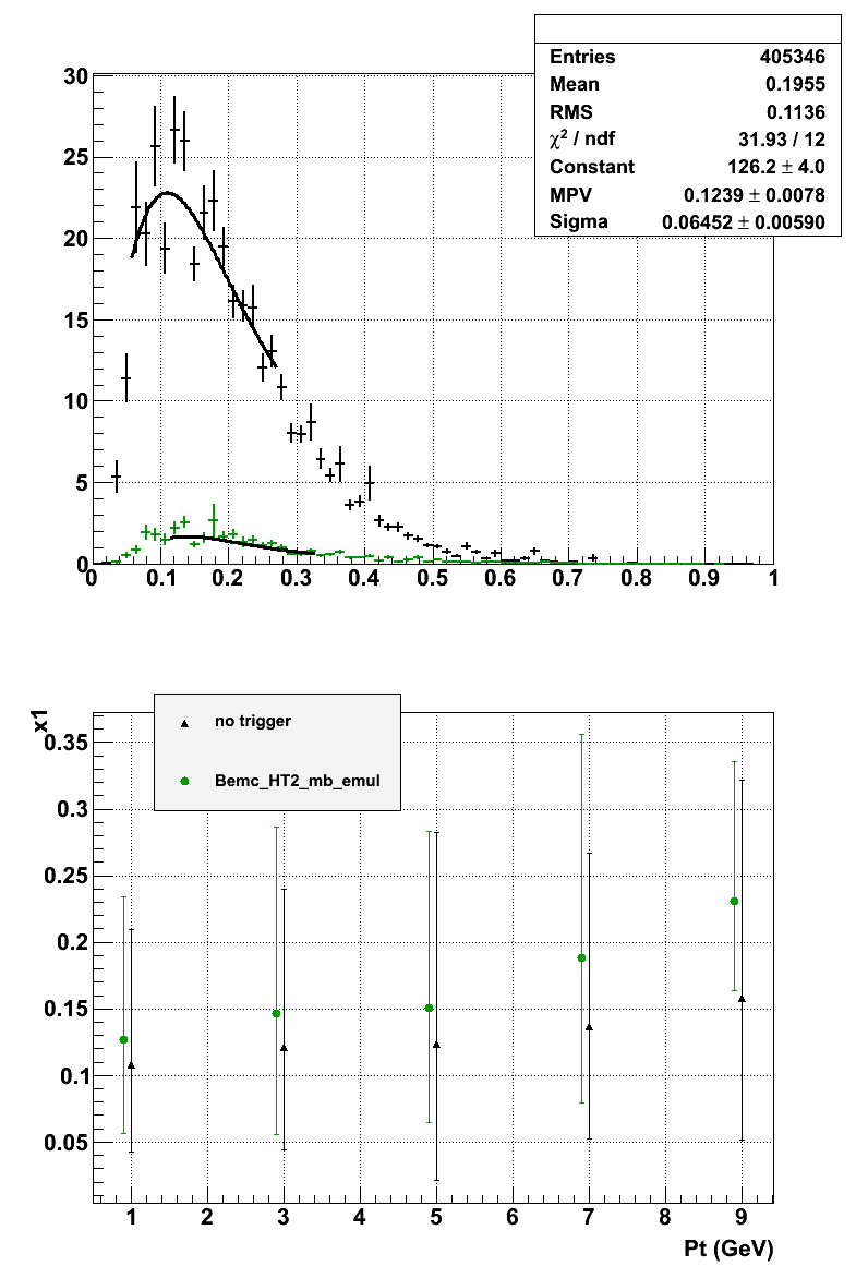
Next up is Bemc_HT2_mb_emul. Again there are much fewer pion pairs that pass this trigger than either of the other two triggers, but it has the largest x1 values.
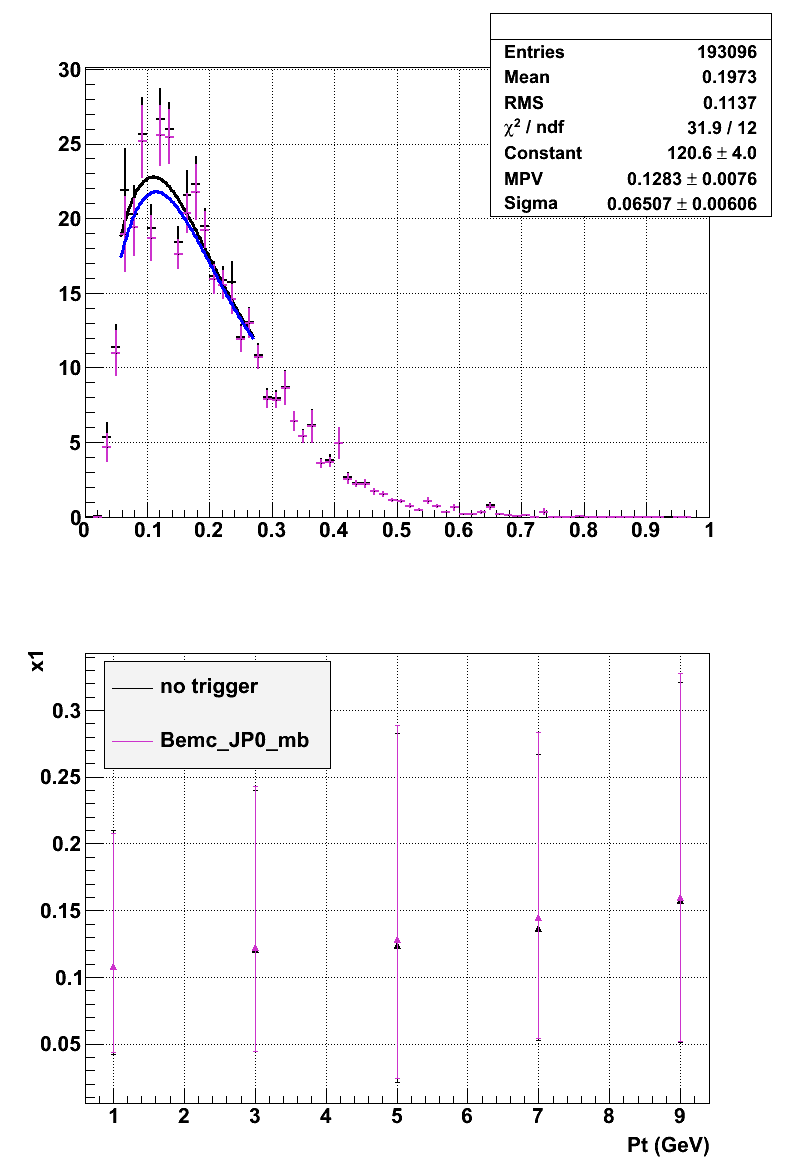
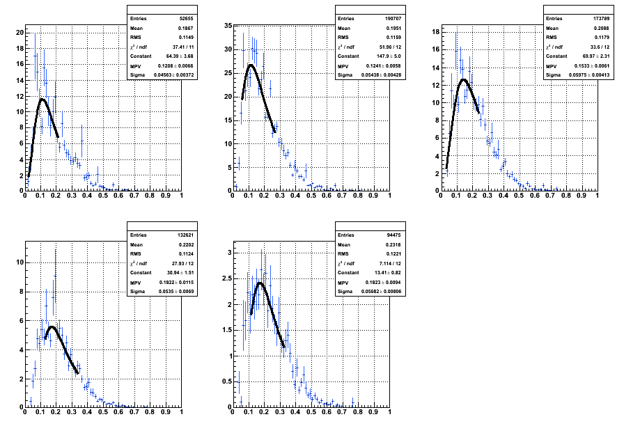
The next trigger is Bemc_JP0_mb. This turns out to be almost exactly the same as no trigger.
Finally we have Bemc_JP0_etot_mb_L2Jet.
To compare the x1 dependence on Pt for different triggers I plotted them all on the same graph along with no trigger.
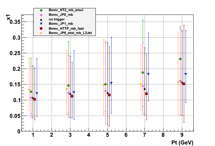
Again, The Bemc_HT2_mb_emul has the largest x1 values and the x1 value for everything increases with Pt.
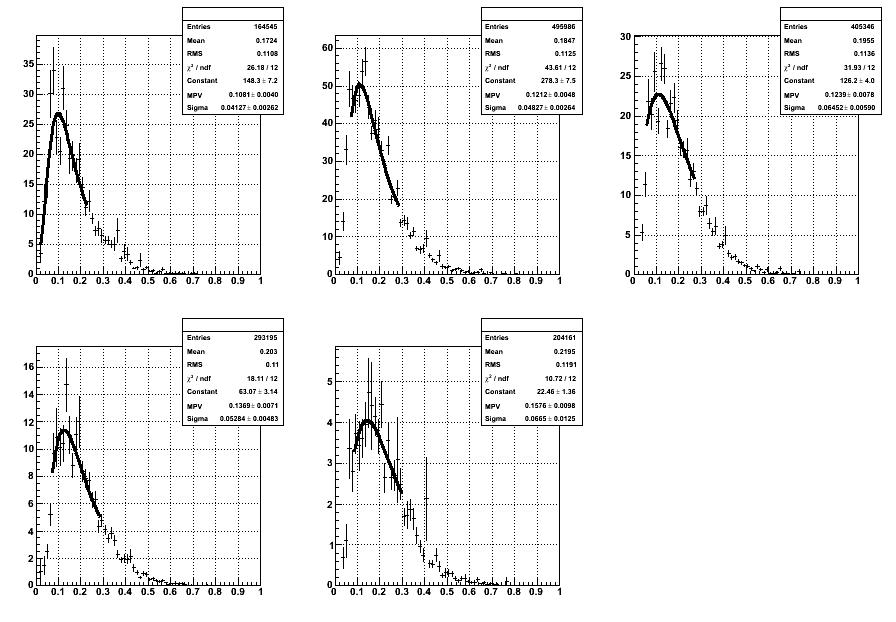
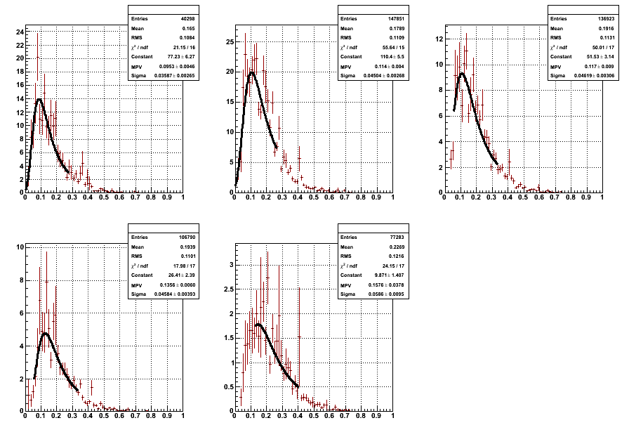
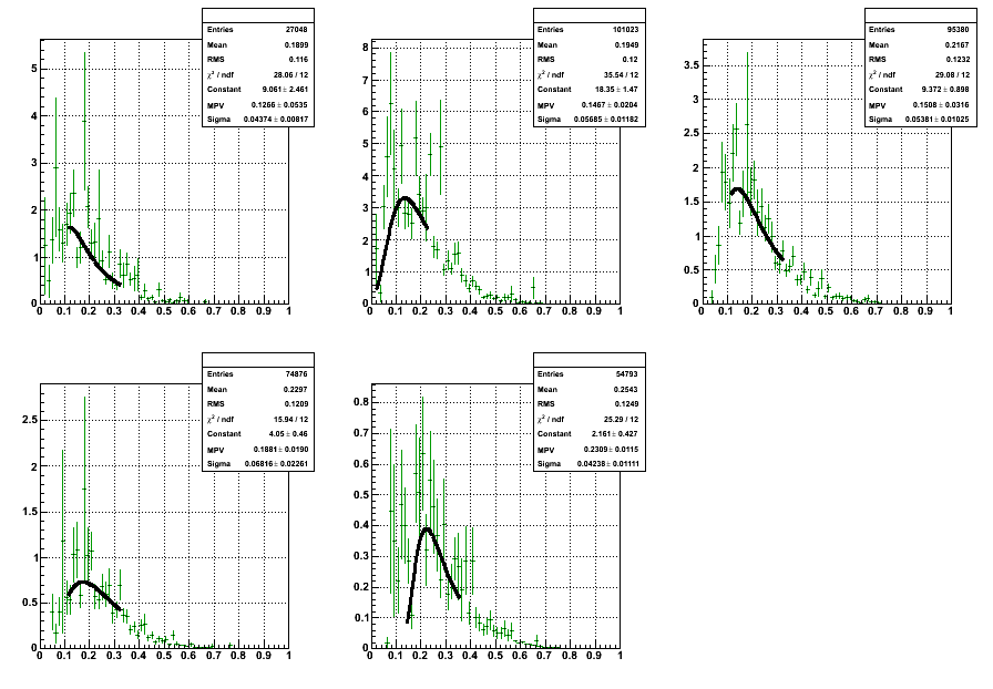
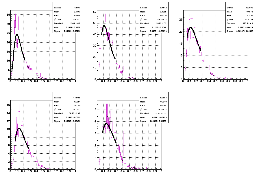
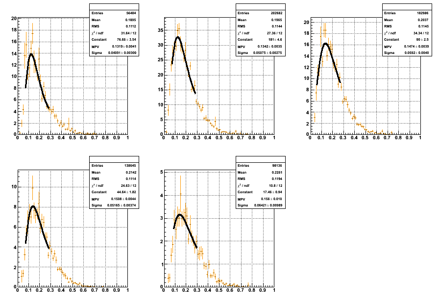
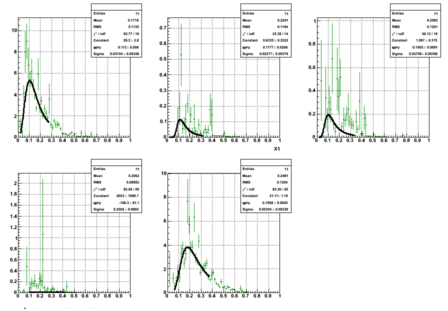
Below are the x1 distributions for all Pt bins and all triggers.
Black = no trigger selection
Red = Bemc_HTTP_mb_fast
Blue = Bemc_JP1_mb
Green = Bemc_HT2_mb_emul
Magenta = Bemc_JP0_mb
Orange = Bemc_JP0_etot_mb_L2Jet
Pt bin increases from top left to bottom right.
0-2, 2-4, 4-6, 6-8, 8-10 GeV
You can see that some of the fits for Bemc_HTTP_mb_fast and Bemc_HT2_mb_emul are not ideal. This is because I was trying to fit around the peak of the distributions while the bin with the highest value was far from the actual peak of the distribution. At some point I want to go back and refit these cases.
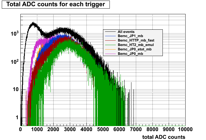
To make sure selecting different triggers has an effect on the data, I created a histogram of the total emc ADC counts for events from each trigger. All the triggers cut out the low energy peak seen in all events. It's hard to see the orange line (Bemc_JP0_etot_mb_L2Jet) because it's being covered by the blue and magenta lines, but it's right in between the two.
The data used was pp200 GeV 2006 geometry.
The files used are located /star/data47/reco/pp200/pythia6_410/
The cuts I used were:
abs(eta) < 1.4
dca < 2
trackPt > 0.5 (I also did the same thing for trackPt > 1.5)
nHitsFit > 15
List of trigger ID numbers:
Bemc_JP1_mb
117221
127221
137221
137222
Bemc_HT2_mb_emul
117212
127212
127213
137213
Bemc_HTTP_mb_fast
117821
127821
137821
137822
Bemc_JP0_mb
117501
117501
137501
Bemc_JP0_etot_mb_L2Jet
117621
117622
127622
137622
Continuing my look into X1, I plotted x1 and x2 vs Eta.
For No Trigger:
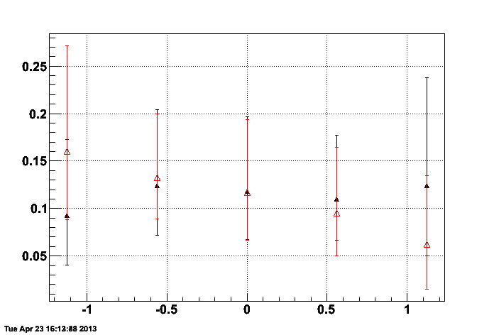
This is what we would expect. X1 is large at larger eta and X2 is large at smaller eta.
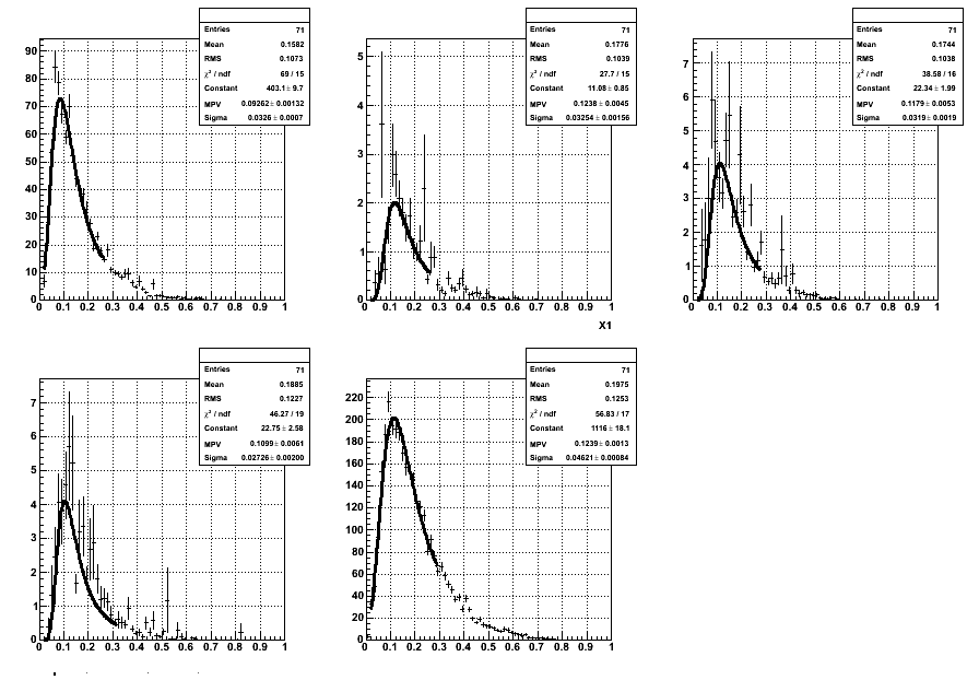
Below are the fits for X1 for each eta bin.
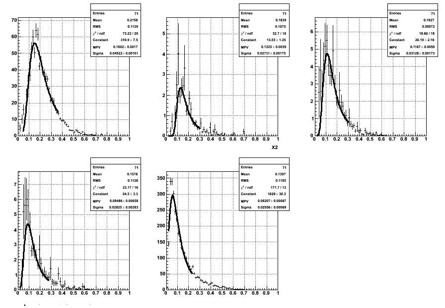
Below are the X2 fits for each eta bin.
For other triggers, the fits in some of the eta bins were very poor. As an example, here are the fits of x1 for HT2_mb_emul in each eta bin.
As you can see some of the fits are really terrible and don't give an accurate value for x1.
- klandry's blog
- Login or register to post comments