Asymmetry vs Radius with more data
I previously posted Asymmetry vs Radius plots that suggested a possible radial dependence. The East Yellow and West Blue plots are very similar so I will only show one here.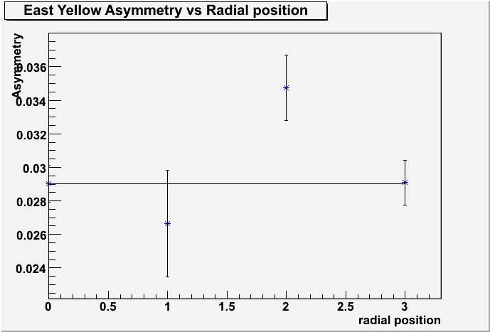
The Y axis is the physics asymmetry and 0 on the x axis is the point for the average, while 1, 2, 3, are the inner, middle, and outer rings respectively. As can be seen from the above plot with roughly one million events there is about a two sigma difference between the middle range radius point and the average of all radii represented by the horizontal line. I went back and made the same plots this time using roughly four million events and it yielded the following.
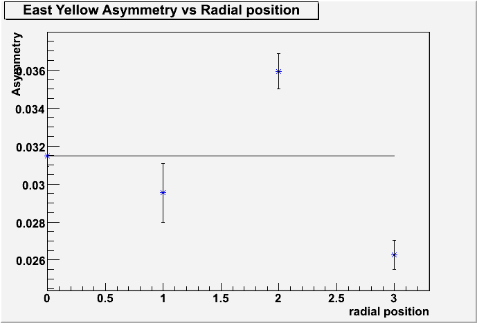
With more data the values including the average have changed somewhat but the basic shape is still similar. However, due to the greater number events there are smaller error bars on the points which shows nearly a five sigma difference between the middle radius and the average. The West Blue plot is very similar and gives over a five and half sigma effect. This is evidence that there could be a radial dependence for the physics asymmetry.
The values for these points are obtianed by running the assymetry programs previously posted but with different header files that only include one ring at a time. A ring being a full "circle" around the detector. Ofcourse with rectangular bins we cannot have a true circle so this method is approximate.
Attached below are the six panel plots for the asymmetry that form these points. The first six digits are just the range of days included in the data. EY and WB signify East Yellow and West Blue respectively and r1,r2,r3 are the innermost, middle, and outtermost radii respectively.
- nkellams's blog
- Login or register to post comments