EPD - Timing Correletion, slew correction, vs bbc
Executive Summary:
This outlines a first attempt to slew correct EPD and BBC channels in order to determine the timing resolution of the EPD. This will be done by comparing "good" signals in overlapping BBC and EPD channels after the correction. The timing resolution seems to be about 3.4 ns, which is larger than expected. Code clean up and checking will commence.
The slew correction for the EPD by "bin" (divided into 8) is:
drupal.star.bnl.gov/STAR/system/files/EPD_slew_18119029.png
The slew correction for the BBC is:
East: drupal.star.bnl.gov/STAR/system/files/BBC_1_slew_18119029.png
West: drupal.star.bnl.gov/STAR/system/files/BBC_2_slew_18119029.png
For both, the widths are the RMS from the histograms. Note that there could be some room for optimization. The corrections were checked, see:
EPD:
BBC:

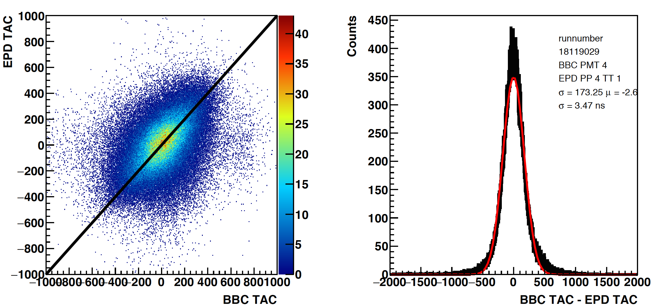
Then, the comparison of the corrected TAC for a BBC and EPD channel was made (selecting on good signals in both):
Analysis:
First, I plotted the values of EPD ADC channels and TAC channels without any selection. This was using .dat files and the StEpd data file to create trees (which I have kept on rcf if others wish to analyze the data).
PP4 -> QT32b
PP5 -> QT32c
PP6 -> No timing
These plots can be found at:
drupal.star.bnl.gov/STAR/system/files/EPD_unc_ADC_TAC_18119029_0.pdf
I then selected "good" signals (ignore the QT32c plots) and plotted this at:
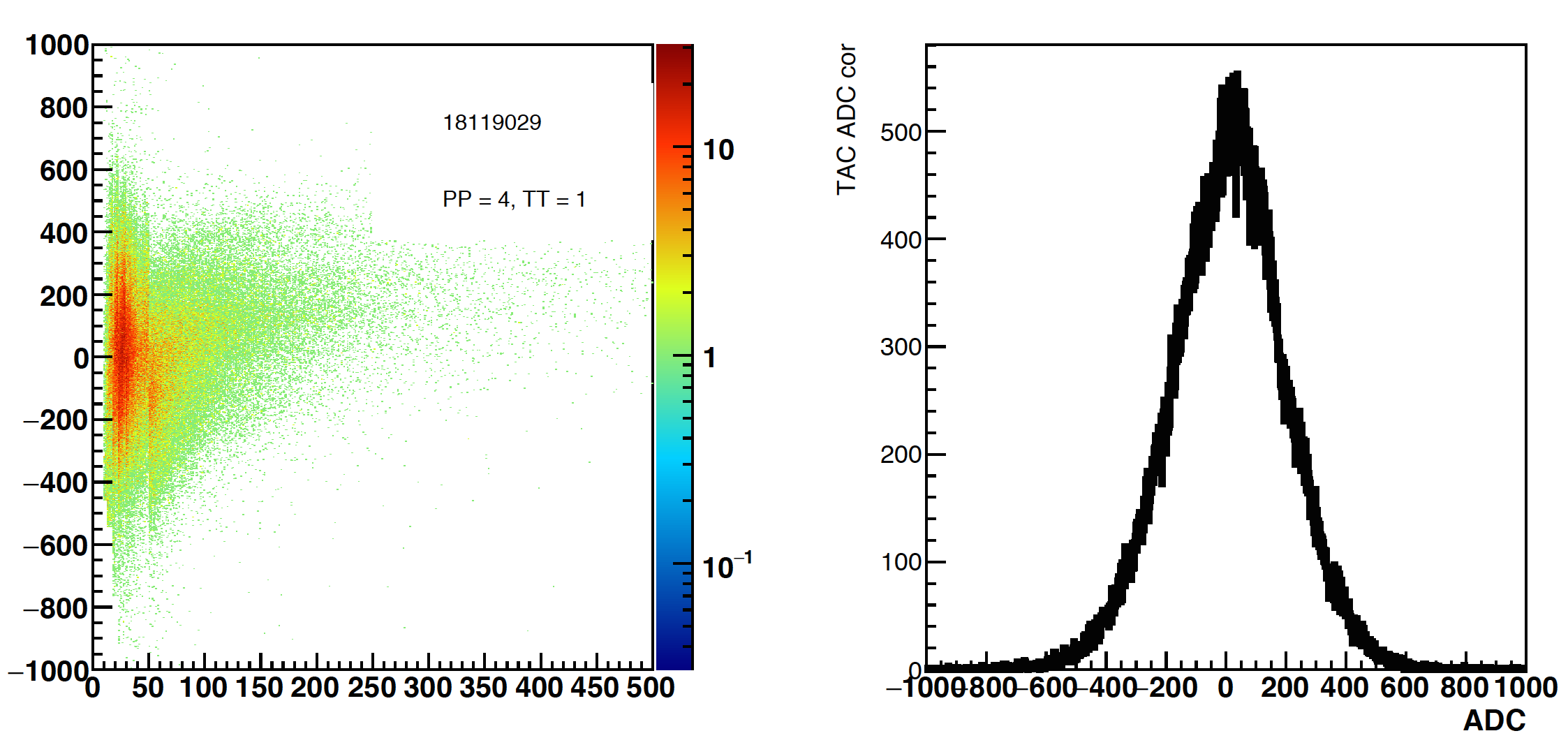
drupal.star.bnl.gov/STAR/system/files/EPD_cor_ADC_TAC_18119029.pdf
On the left, the 2D plot is for TAC > 200 and ADC > 10
For the middle, this is the TAC with ADC > 10
For the right, this is a zoomed in plot of the ADC with TAC > 200
To create the slew correction plots, I used these selections. I broke each channel into 8 different selections:
10 < ADC < 13
13 < ADC < 18
18 < ADC < 23
23 < ADC < 30
30 < ADC < 35
35 < ADC < 40
40 < ADC < 50
50 < ADC
The idea is that we would only have 8 bins ... I tried to break it up such that I was taking the bins where the curve was changing the most. The results, sorted by selection vs color can be found at:
drupal.star.bnl.gov/STAR/system/files/EPD_Slew_18119029.pdf
The 10 < ADC < 13 in black has some pretty terrible statistics.... But ok. This was for one run.
It's probably a little more educational to see the summary, which is the average of the histogram and the error bars are the RMS:
drupal.star.bnl.gov/STAR/system/files/EPD_slew_18119029.png
Other than the first bin, it's sort of a reasonable shape.
Next, I reran over the same data and for tiles that had:
ADC > 10
TAC > 200
I applied the correction TAC_cor = TAC - Slew(function of ADC)
If done correctly, we expect a roughly Gaussian spread about TAC_cor = 0. The 2D distributions with respect to ADC, and their projections are at:
drupal.star.bnl.gov/STAR/system/files/EPD_TAC_checkcorrection_18119029.pdf
For the most part, these look ok. (I will repeat with a larger statistics data set -> Several runs, and try to optimize a little more.)
Then I did the same analysis on the BBC.
First raw selections: (Note I rebinned by 10 so each bin is 10 ADC or 10 TAC because otherwise the file was stupidly large.)
drupal.star.bnl.gov/STAR/system/files/BBC_unc_ADC_TAC_18119029.pdf
Then I plotted the same thing for "good" signals:
drupal.star.bnl.gov/STAR/system/files/BBC_cor_ADC_TAC_18119029.pdf
The left plot is zoomed in. The middle plot is the TAC for ADC > 100 (note different than EPD). The right plot is the zoomed in ADC value for TAC > 200.
Again, I had 8 different "bins":
100 < ADC < 110
110 < ADC < 120
120 < ADC < 130
130 < ADC < 140
140 < ADC < 150
150 < ADC < 200
200 < ADC < 300
300 < ADC
The slew correction files can be seen at:
drupal.star.bnl.gov/STAR/system/files/BBC_Slew_18119029.pdf
With the more useful summary at:
East: drupal.star.bnl.gov/STAR/system/files/BBC_1_slew_18119029.png
West: drupal.star.bnl.gov/STAR/system/files/BBC_2_slew_18119029.png
Then we want to check the correction (rebin by 10 for the 2D plot):
drupal.star.bnl.gov/STAR/system/files/BBC_TAC_checkcorrection_18119029.pdf
Ok, things look mostly ok. The next thing we would like to do would be to compare the BBC and EPD timing. What we would want to look at is the tiles that overlap, the idea is that we will then be looking at the same particle.
These correspond to BBC pmt: 4,5,6,13,12,14,15 for the small
19,20,23,24 for the large
Here I look at the correlation between pmt 4 and 5, with PP4 tiles 1,3,5,6drupal.star.bnl.gov/STAR/system/files/BBC_vs_EPD_18119029.pdf
- rjreed's blog
- Login or register to post comments