Looking at EP with the EPD in AuAu 27 GeV
I started using the code that Mike wrote, used in this analysis: https://drupal.star.bnl.gov/STAR/blog/lisa/first-look-ep-resolution-27-gev-auau
I am currently looking at data from Day 140 - 144 using picoDsts downloaded from the fast offline. (Total 679,057 events)
First I made some very simple QA histograms:
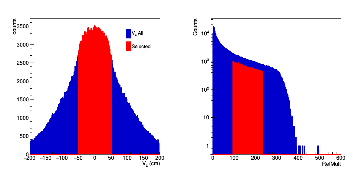
Figure 1: Distribution for all events is in blue, for the events used in this analysis is in red.
First default selection is |Vz| < 50 cm. We are also roughly selection centrality from 10 - 40% in order to maximize the resolution.
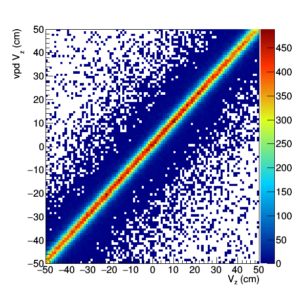
Figure 2: TPC Vz versus the vpd Vz. We note here that the vpd is now calibrated and should be used directly.
There are currently no cuts on the vpd Vz, this would be the first thing to try.

Figure 3: Refmult versus the number of mips on the left for all events with |Vz|<50. In the middle we see this for the selected events. On the right we see this versus TOF.
I find it interesting that the Landau spikes so obvious in the left plot are essentially gone for the others, but it could simply be a trick of statistics. For the actual EP analysis, the maximum was set to nMIP = 1 for any given tile. From Figure 3 we do see some "out-of-time" events in the noise. This should mostly vanish with a vpd Vz cut.
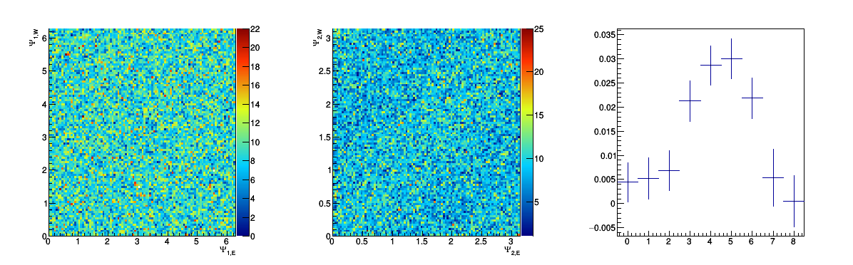
Figure 4: Left is the order 1 correlation (with sign of the QVector on the east side flipped for the first order plane). The middle is the second order, and the right is the projection on centrality bin.
So after the cut (and I ran twice so that I am using the correction procedure written by Mike) I see:
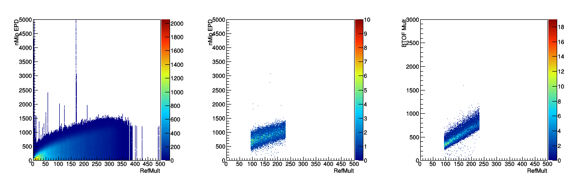
Figure 5: On the left, the RefMult versus nMip, the middle is the same after the selection. The right is the TOF Mult versus RefMult after the selection.
We see from Figure 5 that the vpd vz cut cleans things up considerably, at least with respect to the event quality. Unfortunately, this seems to do nothing for the EP.
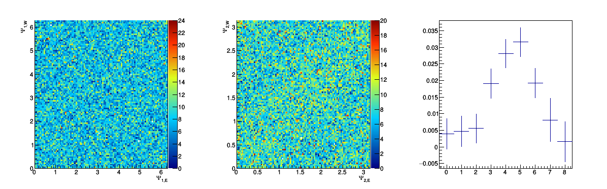
Figure 6: Left is the order 1 correlation (with sign of the QVector on the east side flipped for the first order plane). The middle is the second order, and the right is the projection on centrality bin.
Looking at Figure 6, I think I don't understand the right plot (EpdCos2shift) as it seems to be the same both times. It's subtly different, but since the difference in event collections is small I suppose I shouldn't be surprised. In any case, I don't see anything in the middle plot (though I can optimistically see a little correlation).
- rjreed's blog
- Login or register to post comments