EEMC Pi0 Mass vs Distance
Some plots comparing the two photon (pi0 candidate) invarient mass versus the distance between the photons, suggesting cuts to remove candidates caused by false cluster splitting. Note, these plots are made using the new EEmcTree framework and TSelectors. [EDIT (06/26/2012): the lower distribution is due to a bug in handling events where the primary vertex position is not defined.]
The thresholds used when deciding whether to keep the event (i.e. a cut on how many strips/towers above some threshold) are lower than used to make the EEmcResponseTree. False cluster splitting seems worse than before, which suggests looking into a possible correlation between SMD energy and false cluster splitting.
First, let's look at the 2D histogram of mass vs. distance for the IU method.
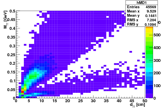
One can see two major distributions, an upper and lower, and three areas of high density are observed: one near the left part of the lower distribution, one near the lower-left of the upper distribution, and a third near the pi0 mass and at a distance of around 8 cm. Lets zoom in on the lower left corner a bit.
There is a few too many bins, but the message is still clear, and each high density area is still apperent. We can then associate a distribution with each high density area. The lower distribution is clearly seperable from the other two. The density near the pi0 mass is due to real pi0s, or at least is unrealted to false cluster splitting. The distrubution peak around 2 cm (4 strips) and extending up into the pi0 distribution is the typical false cluster splitting distrubution considered (i.e. the candidate consists of each of the two parts of the falsely split cluster). Note the typical distances and mass range roughly agree with the back of the envelope calculations from last Fall. The other, lower distribution is a little unexpected. Based on the distances involved and the mass distribution, it appears like the distribution when one of the two photons is falsely split, and the candidate is made using the non-split photon and the lower energy part of the split photon. Note, a cut requiring dgg > 4 cm would remove much of both distributions related to cluster splitting, while the rest of the lower distribution can be removed by requiring the mass to be greater than some affine function of dgg. [EDIT (06/26/2012): the lower distribution is due to a bug in handling events where the primary vertex position is not defined.]
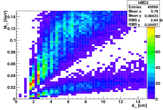
Next, lets take a look at how these compare with data using the Morhac and TSP clustering algorithms. First is the plot for Morhac.
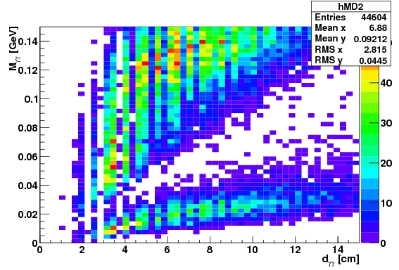
The results for Morhac look very similar to the IU results. All features noted before are present, but the "higher density" regions stand out above the lower density regions more so in the Morhac plot than in the IU plot. Note, the same cuts seem applicable. Next to TSP.
In this case, the false cluster distribution overlapping with the pi0 distribution is no longer obvious. This algrothm was specifically designed and tuned to remove that very distribution, and so this is as expected. The lower distribution is still present.
Since the distributions are distinguishable, and the lower one even quite distinct, it would be wise to introduce some cuts to remove the unwanted distributions. A cut of d > 4 cm seems useful for the IU and Morhac algorithms, while all algorithms, a cut of M > 0.005 GeV + dgg x (0.007 GeV/cm). A few points along the threshold line are
| dgg [cm] | M [GeV] |
| 3 | 0.026 |
| 4 | 0.033 |
| 8 | 0.061 |
| 10 | 0.075 |
| 25 | 0.180 |
Next, we plot the mass distributions for each of the cases: only basic cuts (black), the cuts used for black plus the cut of M > 0.005 GeV + dgg x (0.007 GeV/cm) (blue), and the cuts used in blue plus requiring dgg > 4 cm. The "basic cuts" are that pi0 pT > 4 GeV and both photon energies are greather than 3 GeV. The plots are shown in the order of IU, Morhac, and TSP.
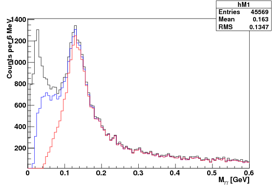
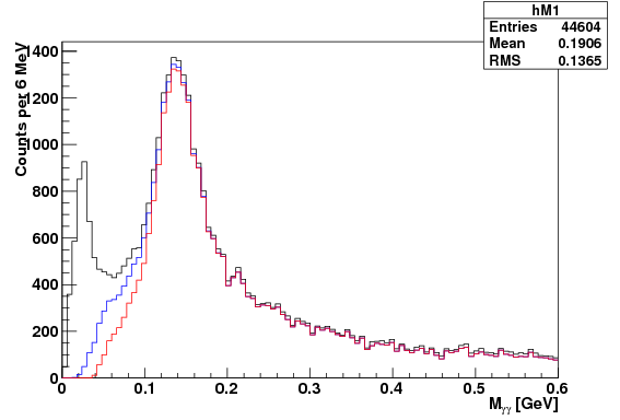
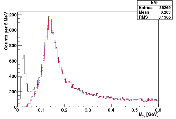
These plots show the same patterns already known--that the order IU, Morhac, TSP is in the order of decreasing amount of false cluster splitting. The entries shown in each plot are for the black line. For the TSP algo, the extra 4 cm cut is not really needed, and so the blue line would be the best choice. Note that the blue line in the TSP (3rd) plot peaks at about 1150 counts, while the red line in the IU (1st) plot peaks about 1250 counts. Thus, while on the surface TSP appears to have significantly lower statistics, the difference in statistics may be come quite minor after all cuts are in place. The peak of the red line for the Morhac algorithm is actually the highest, at around 1300 counts, with several nearby bins above 1200 counts. The IU algorithm only has one bin about 1200 counts.
- sgliske's blog
- Login or register to post comments