First run through plots
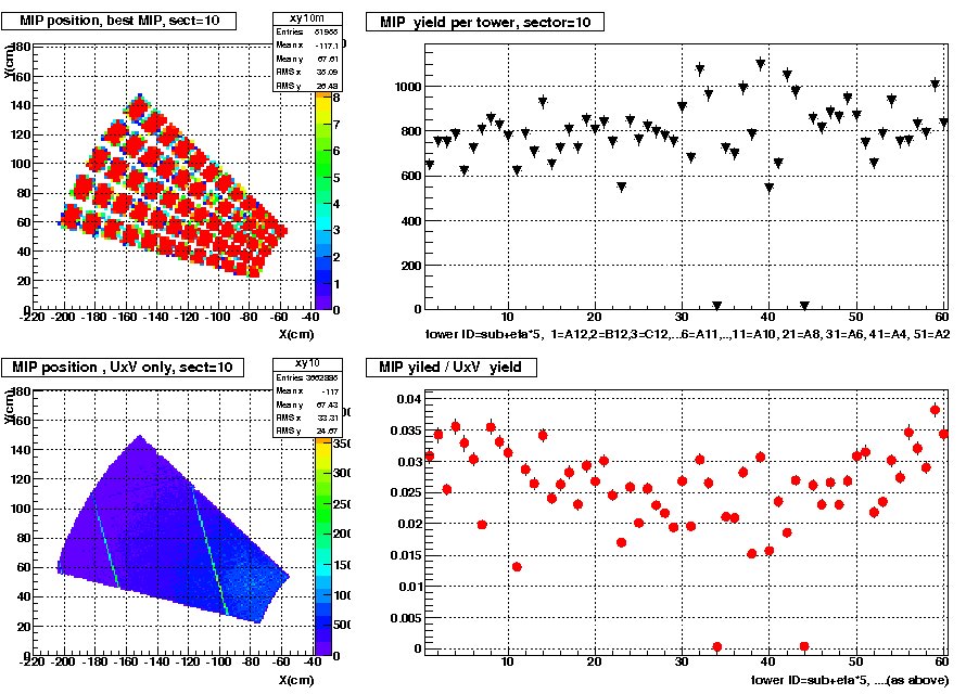
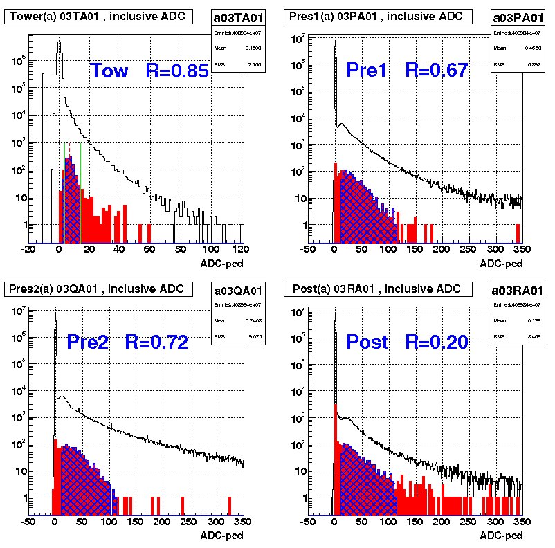
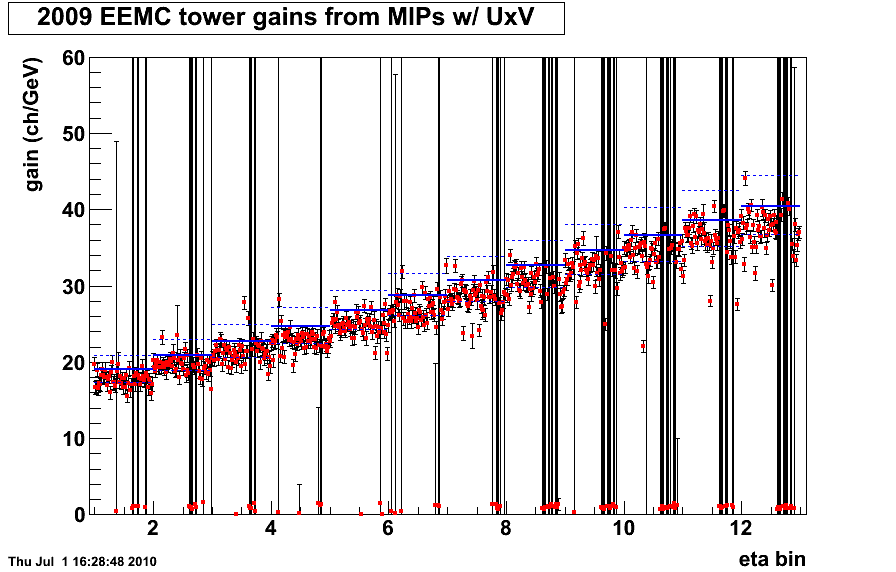
We were able to run the code that creates many plots with our data. The first one plSmdCal.C gives us a .ps file that has four plots in it. two 2D histograms about mip location in UxV. the other two are about mip yield in the sector. plPresMap.C also gives us a .ps file with four plots. It has the tower histogram and fit, pre1 histogram and fit, pre2 histogram and fit, and post histogram and fit. plTwCal.C is one plot of the gains for each tower binned by eta. It also has the ideal gains plotted on it. Below we have examples of the plSmdCal plots and plPresMap plots along with the plTwCal plot. You will notice that the tower gains plot has huge error bars for some of the points. We believe that this comes from the fact that this is only the first iteration of the data.
- znault's blog
- Login or register to post comments