RP Basic Trigger Event Display and Inner vs. Outer Timing
While awaiting our production of new FMS trigger data analysis trees which include upgrades such as RP QT info, BBC QT info, and additional variables from the clustering algorithm, I decided to look a bit more into the RP QT data to see if I notice anything untoward and if there are any more "clean-up" cuts I can make at the scintillator trigger level. Again, to do a true analysis, I will need to await full track reconstruction from the RP group. For now, all I'm able to use are the scintillators.
This page presents the following:
-- ADC distributions and "rescaling" as a way to "calibrate" the distributions; this rescaling is ONLY used for an event display because I wanted to get an idea of how inner sequencers correlate to outer sequencers
-- Inner vs. Outer sequencer overlap in terms of hottest channel
-- Inner vs. Outer sequencer TAC differences vs. inner sequencer ADC
Data set is 15 runs from day 85
.
.
.
Full ADC distributions
black line is an exponential fit, starting at the blue vertical line, which is a divider line (defined manually) below which we see clear MIP peaks and above which we see exponential falloff, with a high energy tail.
.png)
.
.
.
Rescaled ADC distributions
I rescaled the ADC distributions such that the exponential fall-offs were roughly in the same region; I did this so that I could build an event display, but certainly this not the right thing to do. I only did this to understand how the inner sequencer ADCs looked in comparison to the outer sequencer ADCs

.
.
.
Inner vs. Outer Event display -- HYPERLINK
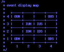
This event display (linked in "hyperlink" in above line) plots the ADC counts for each channel in the left two plots and the correpsonding TAC counts in the right two plots. Top two plots are for east and bottom two are west. All four plots contain bins for Inner/Outer, East/West, and North/South, according to the following map:

.
.
.
Highest Inner ADC overlap with Highest Outer ADC
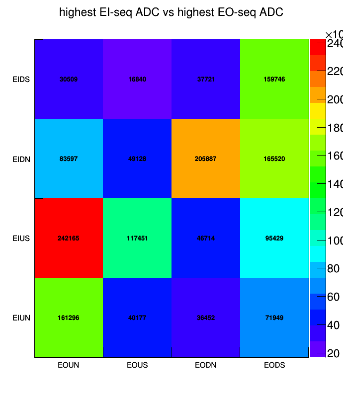
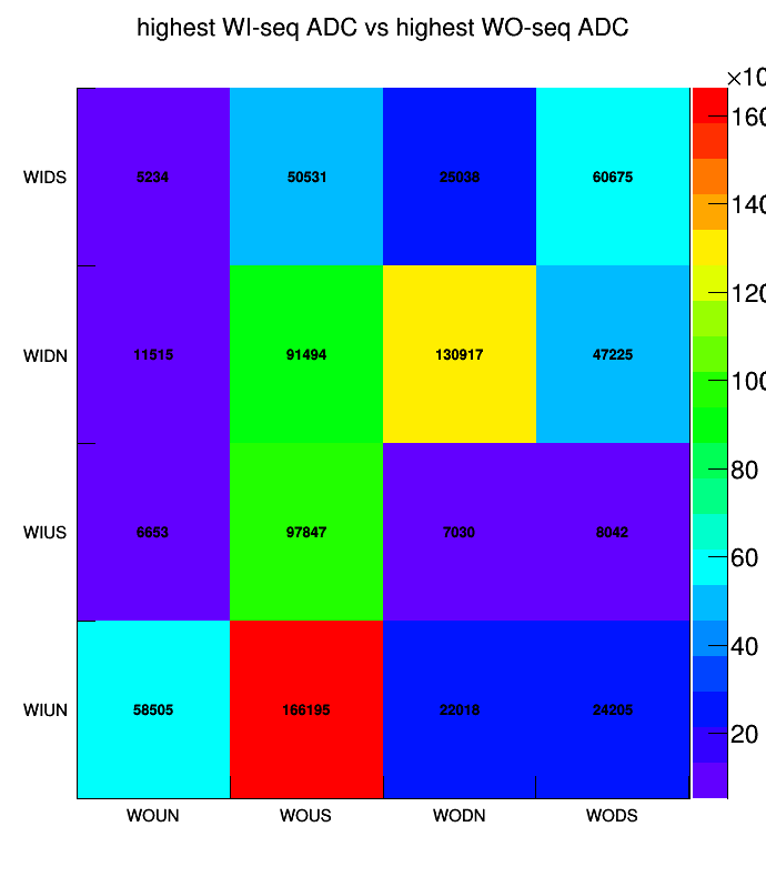
Vertical axis is for Inner sequencer and horizontal axis is for outer sequencer; an entry is added to the bin for highest inner channel ADC corresponding to highest outer channel ADC. I mostly see a diagonal line, but there are some cases where something hitting up-north inner correlates to up-south outer, for example. Note: this is also using the "rescaled" ADC distributions.


.
.
.
TAC difference (outer minus inner seq) vs. Inner seq ADC
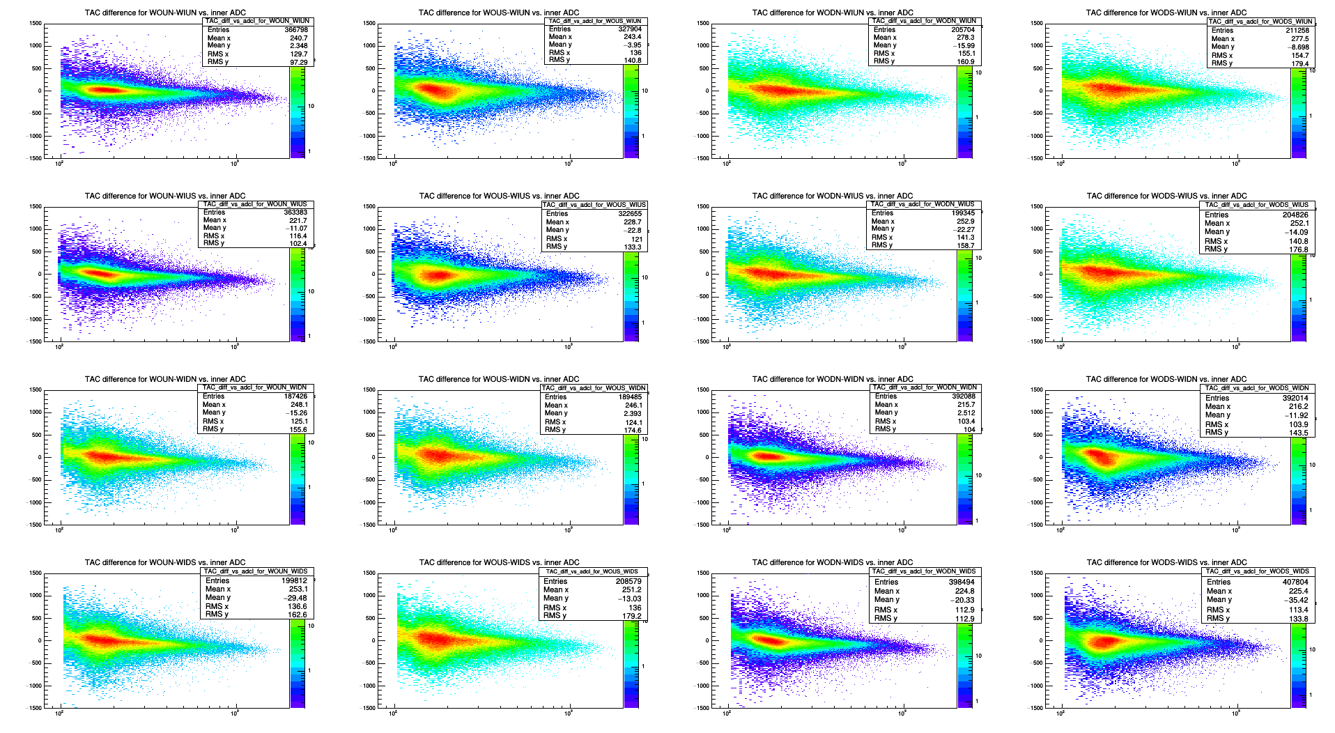
The TACs are shifted such that the gaussian fit to the TAC peak is at 1,000 counts for all channels. The upper left 2x2 block and the lower right 2x2 block are for cases up-inner compared to up-outer and down-inner compared to down-outer, respectively. The other two 2x2 blocks are for down compared to up and vice versa. The vertical axis is the TAC difference, and they are a bit narrower for the up-up and down-down blocks than for the up-down and down-up blocks. Also, this TAC difference seems to decrease to zero as a function of inner sequencer ADC. (It increases from zero from the negative side when plotted as a function of outer ADC)

------
------

- dilks's blog
- Login or register to post comments
