EPD Calibration check for 2018
In this blog by Mike, he noted as expected the first mip peaks of the EPD are the same for both the Isobar runs (at 200 GeV) and for the 27 GeV Au+Au run: drupal.star.bnl.gov/STAR/blog/lisa/comparing-adc-distributions-isobar-and-auau-data-2018-run
An example is:

Figure 1. ADC for West PP12 TT5 comparing the 27 GeV (blue) to the Isobar (red) where the Isobar data comes from days 120 - 125 and the 27 GeV comes from days 130 - 131.
However, Skipper presented in the EPD group meeting: drupal.star.bnl.gov/STAR/system/files/EPD_02_08_2019_Kagamaster.pdf
Plots that show a discrepancy between the Isobar running and the 27 GeV running. Most importantly:
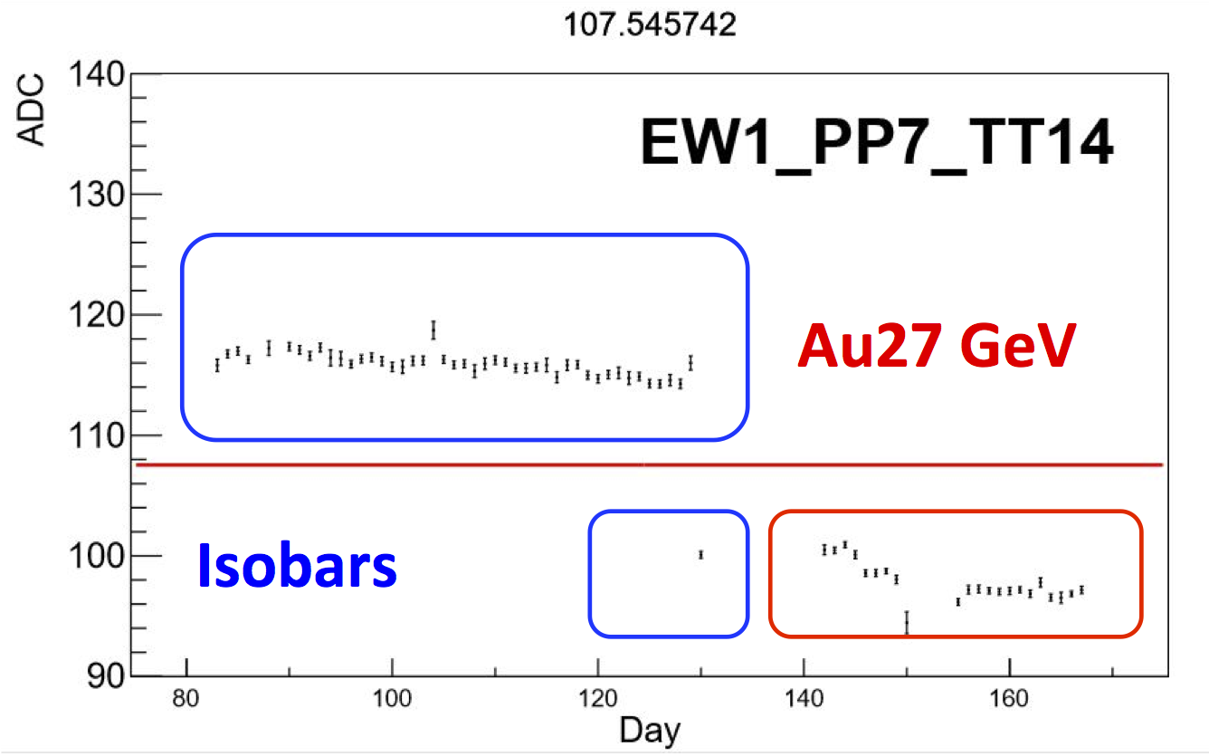
Figure 2: Day by Day comparison from calibration code run by Skipper.
It should be noted that Mike's plots came directly from the recorded data (I think most likely the .dat files where I had created the histograms for him to analyze, but possibly from fast offline.) Skipper used fastoffline for the 27 GeV data, but for the Isobar data he used the MTD triggered data for that calibration as we did not save the fastoffline before it disappeared from disk. (Lesson learned.) This changed the mixture of the 1 mip to 2+ mip peaks, and in order for the fit to behave for the innermost tile he did have to make some centrality selections. However, this should not create this sort of an effect.

Figure 3: Comparison of the two distributions from Skipper.
The fits look reasonable ... The shift doesn't actually look *that* different from what Mike has shown, I can almost believe some shift (I think the lines make it easier to see).
First I looked at the ADC spectra in the 27 GeV data, trying to pull ~50 files from each day from the early/late part of the day in order to fully populate the time span.
An example is:
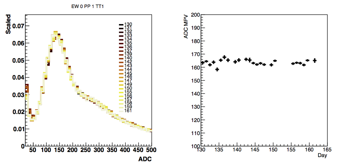
Figure 4: ADC spectra by day on the left for East PP1 TT1. On the right is the MPV of the Landau fit with a 3 mip peak fit function (code ripped from Mike). Investigations show that 2 or 4 yield the same results. WID ~0.16 or so for most tiles in the ADC. Error bars on the right are the errors on the fit.
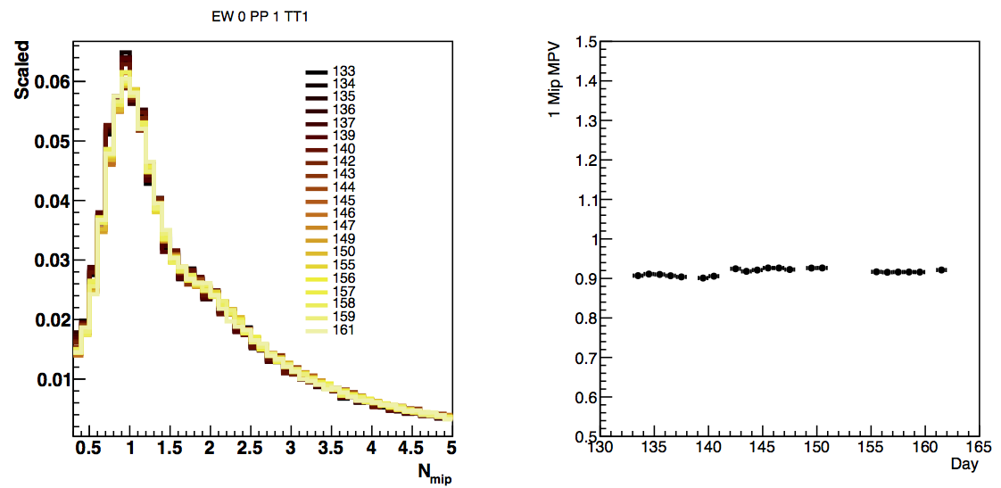
Figure 4: Corresponding nMip structure with the Calibrations entered into the data-base by Skipper and Prashanth. Yes, the fit was that steady in days 155 to 160. I note that the fit works best if I start each one with the same starting value for MPV and WID.
We can then compare the results for all of the TT1 tiles, which physics-wise should be the same.


Figure 5: On the right is the distribution of MPV for the first mip peak for all Tile 1s, and on the right is the distribution for the fit. We see already that the calibration pushes things together, with some outliers. I am surprised at the difference in the ADC spectra, I thought our gain matching was a bit better than that. The highest value is West PP 9 TT 1, the lowest value is West PP 5 TT1.
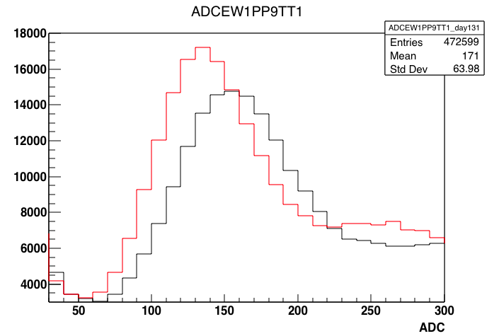
Figure 6: The comparison of the ADC outliers from above, with EW1PP9TT1 in black and EW1PP5TT1 in red. So these were indeed different.
If one wants to look through everything, the pdfs are attached to this blog.
ADC Spectra tile by tile: drupal.star.bnl.gov/STAR/system/files/ADC_All_02102019.pdf
MIP Spectra tile by tile: drupal.star.bnl.gov/STAR/system/files/nMip_All_02102019.pdf
ADC MPV Tile Comparison: drupal.star.bnl.gov/STAR/system/files/ADCFit_02102019.pdf
MIP MPV Tile Comparison: drupal.star.bnl.gov/STAR/system/files/nMipFit_02102019.pdf
Looking at the tile AFTER Skipper's Tile, which is interesting in its own right. But not the same... :-/


Figure 7: West PP7 TT14... This ended up being a very odd tile.... It changed around day 155 (which I will have to see if we understand). The other tiles with high ADCs seem to be consistent (as you can sort of see on the plot on the far right). You can also see the shifting on the plots to the left.... But as I stare at this, I wonder whether my macro is consistent between the colors on the right plot and the days on the left. NEED TO CHECK. I might have out clevered myself with the color scheme.
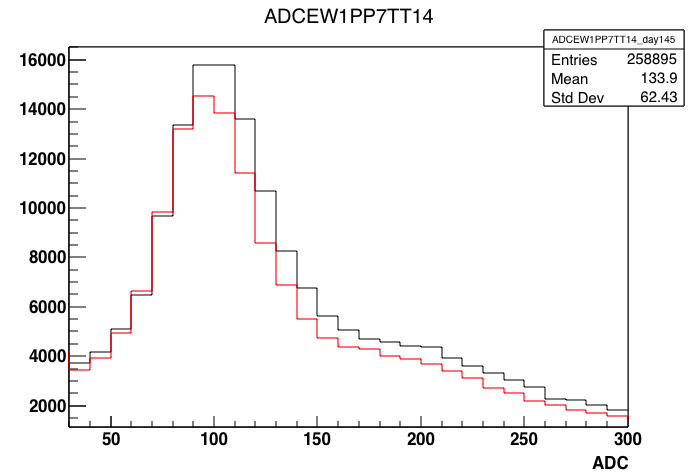
Figure 8: EW1PP7TT14 for days 145(black) and 159 (red)... This indicates that my color scheme on the first plots is wrong but my summary plots are correct.
What does this look like from the nmip point of view?
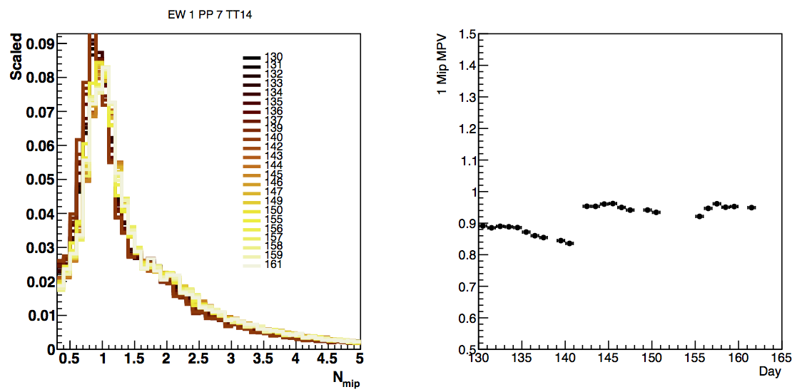
Figure 9: nMip comparison for EW1PP7TT14... The color scheme here seems to match my plots to the left. I will have to check a little closer. It is good to see that the range is definitely closer with the calibration.
- rjreed's blog
- Login or register to post comments