EPD - Timing Correletion, slew correction, vs bbc II
Executive summary
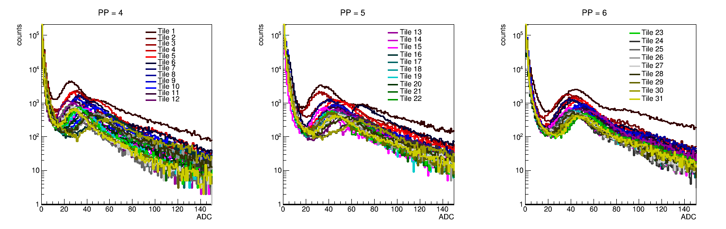
I continued the analysis of the slew-correction shown last time. For channels where the binning makes sense, we see less than a 5% variation in the bins (mostly in the region where you get the largest change in the ADC-TAC curve). Some channels had a greater variation, and this is not due to statistics but to having a "bin" that did not contain enough of the actual curve. This indicates that we will probably start with an automated process for a "first check" of the slew curves, and then some will need some individual work. But this is one reason we should tune the Vbias so the MIP peak in the same place for most channels.
All possible BBC (overlap BBC tiles) EPD correlations are shown. For tiles that genuinely overlap, the combined curve is ~3.4 ns. For the large tiles - EPD correlations, it's more like 6 ns. But the large tiles really do not perform well. I will fit these distributions and produce a few better curves for the STAR meeting.
Correlations between BBC-EPD look really good if one uses some sort of veto for the plots. Even just a veto on one of the small tiles has a large effect.
Analysis
This is a continuation of:
drupal.star.bnl.gov/STAR/blog/rjreed/epd-timing-correletion-slew-correction-vs-bbc
In the previous analysis, I had plotted the TAC correction in even bins (though the ADC itself was not chosen in even bins). This was confusing and I have moved to a variable bin size, which also has the advantage of simplifying the selection when applying the correction. I have kept the same selection criteria as before, though there could be some improvements to it.
The first thing I looked at was what the run-by-run variation for the slew correction was:
drupal.star.bnl.gov/STAR/system/files/SlewComparison_runbyrun_05042017.pdf
An example is:
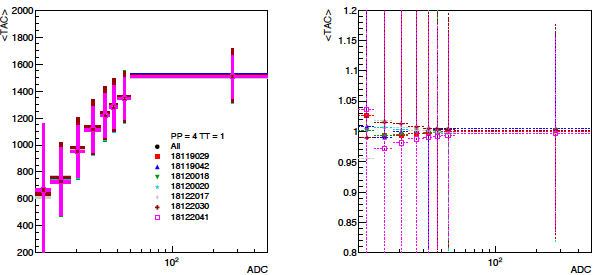
On the left is the distribution of the mean TAC, which is used for the correction. On the right is the ratio of each curve over all of them. The variation is on the order of 5%, and this was true of but a few tiles, and for these tiles the issue was in the first bin. This indicates that an optimization of the first ADC "bin" is probably useful. Looking at the raw distributions, they often have very few counts and so there just isn't enough statistics in that first bin to really see anything. We will have to decide whether it is easier to line up the mip peaks via the vbias or whether we can just compensate with the curves. (I will look at this a bit more...)
Next I extended my previous analysis to all 16 EPD QT32b tiles correlated with all 11 BBC PMTs that overlap the EPD. The full results can be seen at:
drupal.star.bnl.gov/STAR/system/files/BBC_vs_EPD_18119029_0.pdf
The resolution is ~3.5 ns or so. The black line is still just drawn in... I will change this but wanted to be consistent with earlier results. Since my only requirement for the plot is that the signal is "good" (for the BBC and for the EPD tile in question), the timing resolution is not much different even when looking at tiles that don't overlap that much. What changes is the relative statistics. I think this means that that the particles are coming from the same collision, so the time difference for real signals won't be much. But once there is no overlap now you are looking at the probability of a 2nd particle passing through a particular area.
A characteristic of the small tile correlation for an overlap tile is:

For the big tiles, I am getting a resolution of ~6 ns or so.... I guess that's not so surprising. The correlation is obviously not as strong, either. But I will determine this via fit. [Next time ... ran out of time]
Multiplicity Correlations
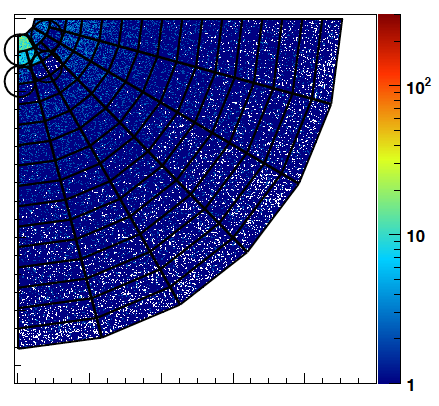
Along with the timing curves, I also wanted to look at the multiplicity correlations, mainly to remake the heat map that Joey generated in a nice form for either the BUR or additional presentations. To start with, I looked at each tile as either a 1 or a zero. First, a plot of the ADC spectra for each of the EPD tiles:
Probably we could play with the bias voltage to line these guys up a bit better....
I took these and the BBC and determined a "1 mip" threshold for all of them... (this was done by eye, perhaps a metric should be developed). The results can be found in:
drupal.star.bnl.gov/STAR/system/files/ADC_only_18119029.pdf
An example for each is:
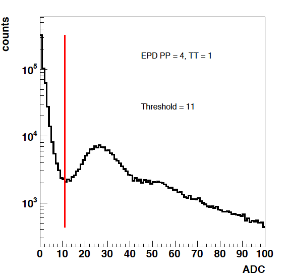
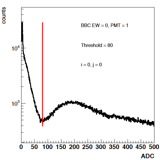
On the left is an EPD tile, on the right is a BBC PMT (small tile). In the pdf one can see why the large tiles weren't really used as it's very difficult to see the MIP peak at all. With these thresholds, we can look at the events and see what the multiplicity correlations look like.
I used these thresholds to look at multiplicity (assuming tiles were only 0 or 1):
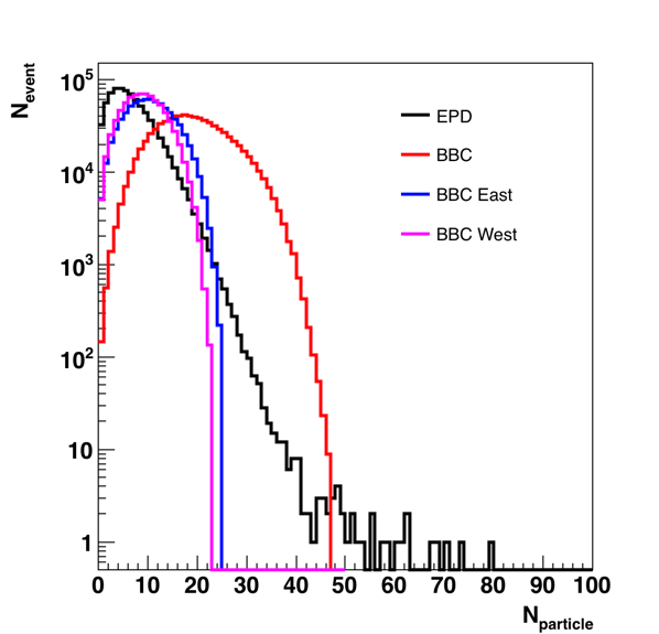
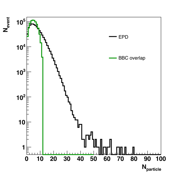
These are 1D plots showing the multiplicity distributions for the EPD and BBC using the thresholds I determined earlier. On the right I look at the multiplicity only for the BBC tiles that overlap the EPD. I think this really shows us the resolution of the EPD, it's rather nice.
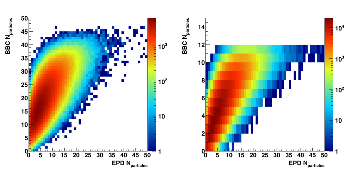
These are the 2D correlation plots for the above data, on the left it is for the total BBC and EPD and on the right it is just for the overlap region.
For an initial analysis, I assumed that tiles could either be a 1 or a 0, so I did not try to do any ADC weighting in the analysis. The presentation that will be shown at the EPD meeting can be found at:
drupal.star.bnl.gov/STAR/system/files/RReedEPDBBCCorr05092017.pdf
The East BBC PMTs that overlap with the EPD are: 4,5,6,14,15,16,17,19,20,23,24. For this analysis I selected PMTs 4,5,13,12 for my analysis which overlap EPD tiles 1 - 7 or so for all super-sectors.
We see good EPD-BBC correlations, as shown below:
For this plot, what I required was a signal in BBC PMT 4 (ADC > thershold), and then no signal in BBC PMTs 5, 13, and 12 (ADC < threshold). Only requiring a signal does not show the correlation as most collisions will have a signal in the BBC tiles that overlap the innermost EPD tiles.
But this looks rather nice in that BBC PMT 4 overlaps PP4 TT1-3, which are precisely the tiles that are overlapped.
- rjreed's blog
- Login or register to post comments