EPD Calibration: First-Peak ADC Values
I'm working on calibrating the Event Plane Detector (EPD) by finding the first MIP peak ADC values via a Landau curve fit. Information on the multiple-peak, Landau fit can be found at Mike Lisa's blog here. This calibration is being done for the Isobar (Au+Au, 200 GeV) PicoDst data. I currently have data for days 110-122, excluding day 115. I shall describe the process used to generate the first peak ADC value for each tile on the EPD. First, let's look at the format of the data and what it means.
The EPD has an East (labelled 0) and West (labelled 1) side. Each side has twelve sectors (labelled by PP numbers), and each sector has 31 tiles (labelled by TT numbers) for a total of 744 tiles. Data generally follows a structure of:
Day E/W PP TT ADC
For example, the ADC value for day 119, East side, sector 6, tile 21, would read:
119 0 6 21 110.787769
In order to generate these values, I first took histogram files from the PicoDst data set (generated by Rosi Reed) and used a macro (written by Grigory Nigmatkulov, edited by Prashanth Shanmuganathan and myself) to make histograms which had EPD data, event by event, on ADC for each tile (file included; PrashRunAnalysis.C). This would give a file by file set of histograms, which I would then combine until I had a day by day tree of 744 ADC v. Counts histograms. Each day's histograms was then run through another macro (FindNmipWest.C), which I separated into East, West, and Correction for the East side, West side, and Corrections for individual tiles which had poor fits (more on that later). This macro (written by Mike Lisa and edited by myself) would perform a multiple peak, Landau fit and return a set of plots with each tile and a text file with all of the tile's values (with the data structure as indicated above).
Here is an example of the nMip fits (Day 113, West, PP 10):
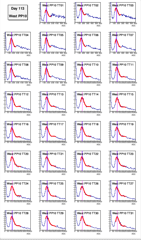
The blue line indicates the expected value, the pink line the found peak value, and the red line is of course the fit line. This snapshot shows what we would ideally like to see; everything looks pretty solid and within parameters we'd expect. However, some tiles don't have a very good fit and must be adjusted manually by fine-tuning the parameters in the FindNmip macro. In order to save the tedium of locating these by inspection of the graphs, the text files will have indications of when a value is far enough away from the expected ADC to cause concern. Here is an example:
112 0 3 15 94.197552 <---------- different from nominal
This output on the text file alerts me to inspect the graph. In this case, the graph looks like:
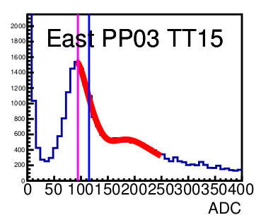
It is clear that the first peak value is different than the expectation, but the peak itself is indicating the correct spot on the graph. Therefore, no fine tuning is necessary and the ADC value given in the text file is correct. Not all cases are like this, of course. Here is an example of a graph where the fit is obviously not correct:
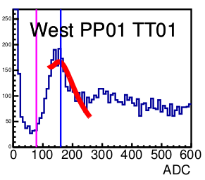
I would then use FindNmipCorrect.C (which is the same macro, but I would play with the fitting constants) to generate something like this:
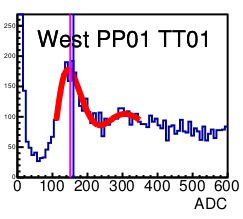
Once the fit looked correct, I would amend the ADC value in the text file for that tile. I have included the text files, pdf graphs, and macros in this blog.
The next step will be to generate graphs of the first-peak ADC values for each tile by day to see if there are any trending deviations from an average value.
- skk317's blog
- Login or register to post comments